Fresh Han
3/17/25 (Mon)
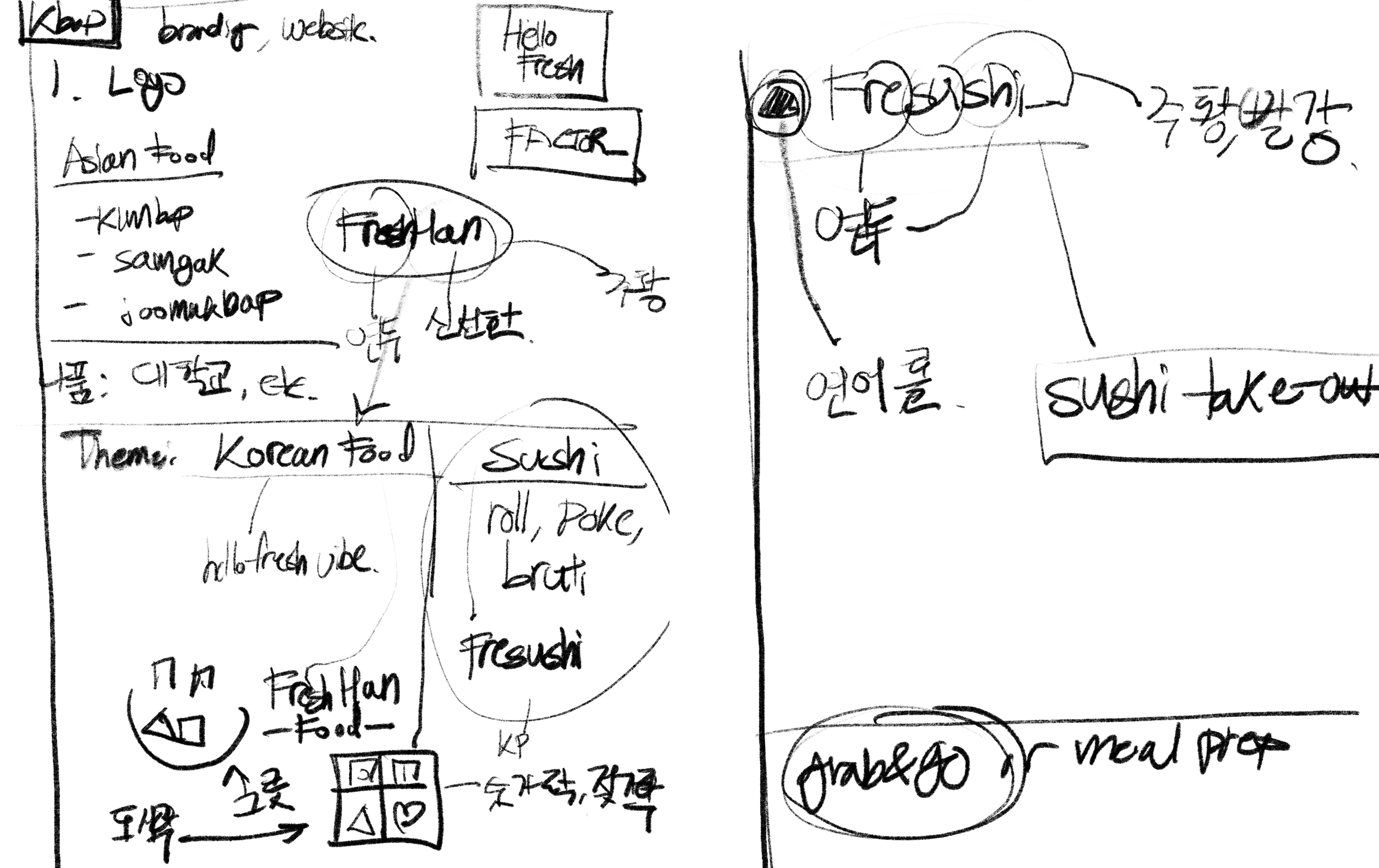
Today I am tasked to design the brand identity for two different companies: Freshan & Fresushi.
They are going to be to-go/meal-prep style fresh food that will be distributed to different locations like airports & convenient stores.
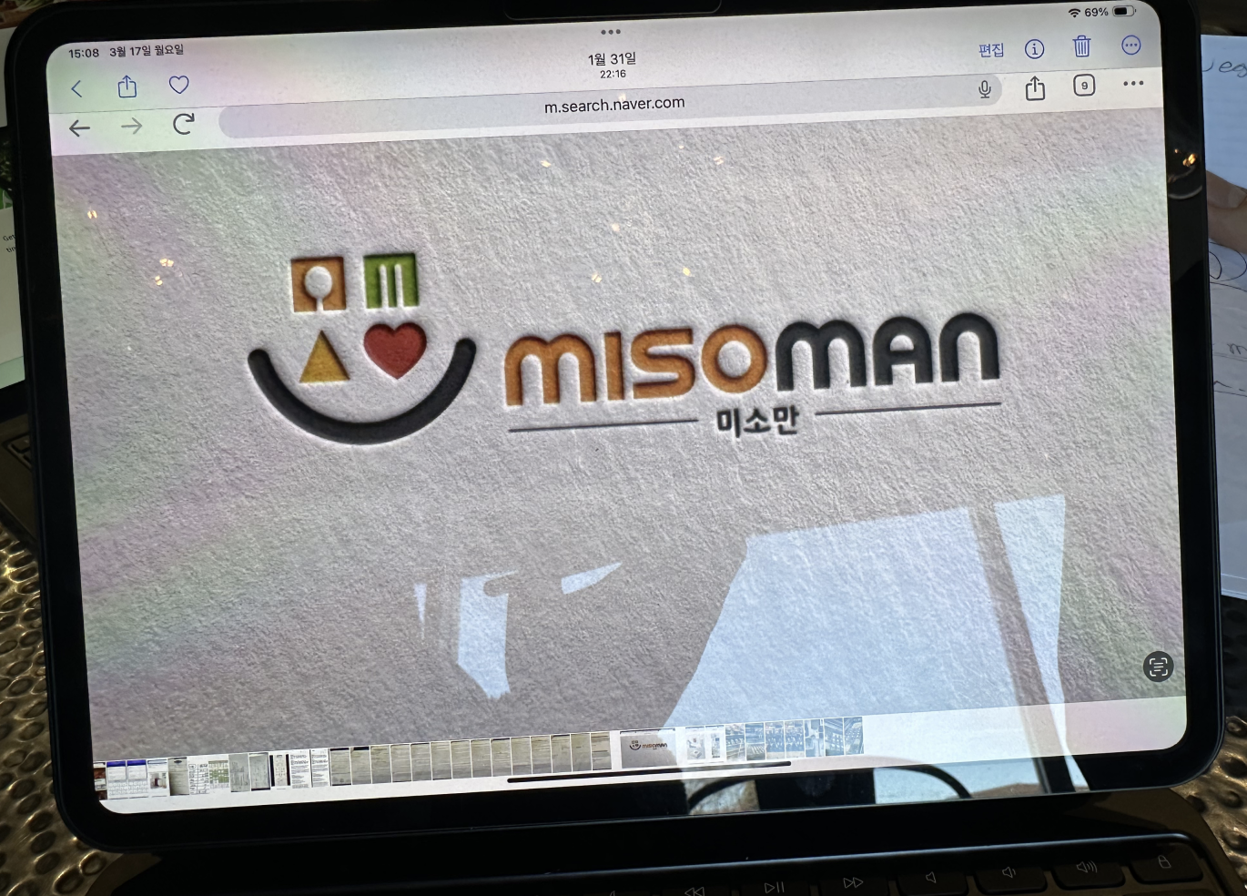
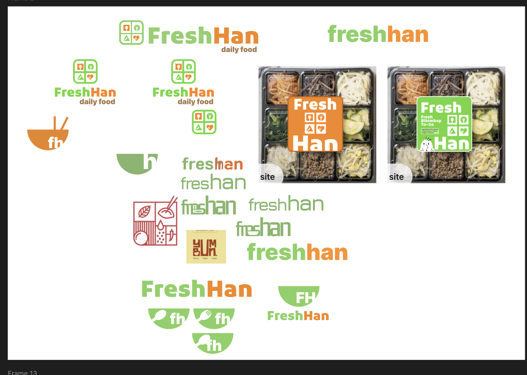
One of the references for the logo is this:
The owner wants the logo to look similar to this above. Basically the left icon reads as a smiley face/bowl containing chopsticks and a spoon with some triangle and love symbols which speaks of the mission of this company very well both emotionally and logically.
3/18/25 Tuesday
Today I am going to make some logos for Freshan and Fresushi and have some mock-ups that convey the branding convincingly.
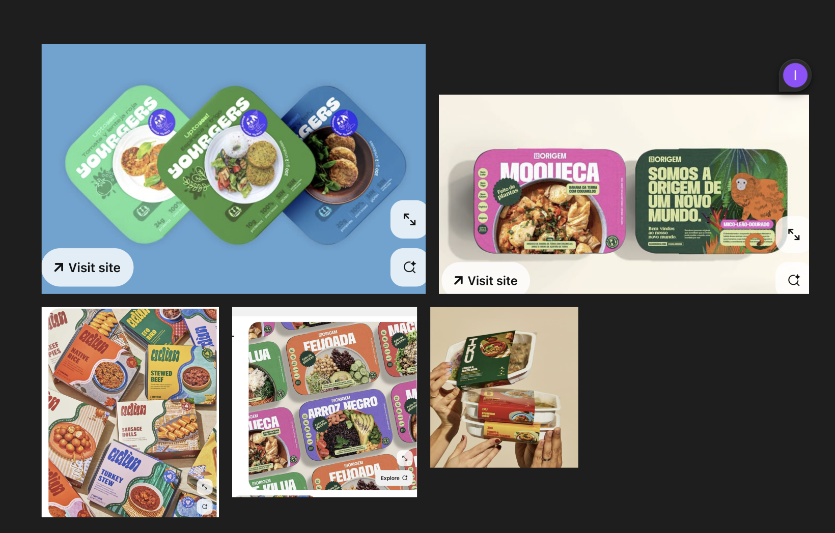
For now, this is the moodboard I made:
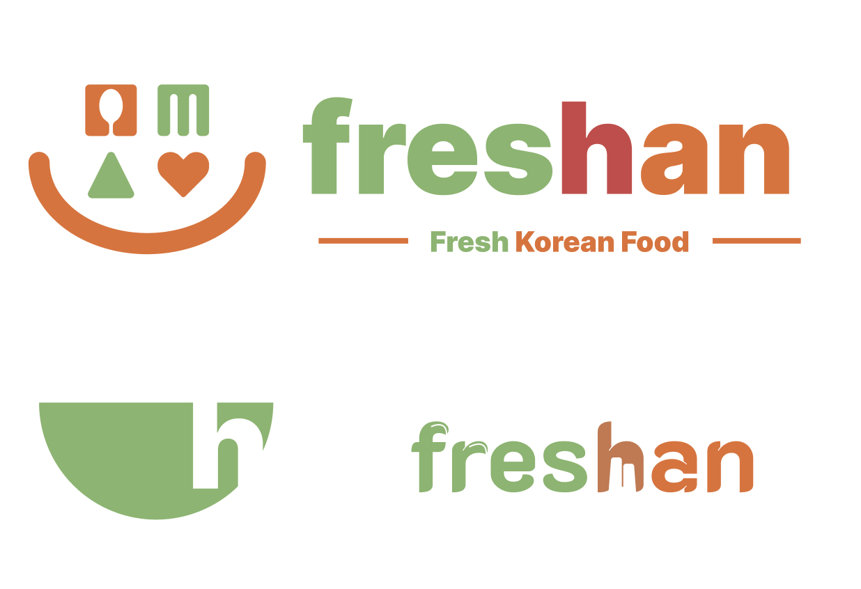
And currently, I am exploring Freshan’s logo that is directly influenced by the above Misoman logo.
The challenge here is #1, not making it look like it’s Misoman logo and #2, getting rid of unnecessary details to make it look clean yet distinct like the FedEx logo. And lastly #3, making sure the wordmark doesn’t read as fres han but reads as fresh an because it’s technically fresh han, han in Korean means fresh and it also happens to be the first part of the word Korea in Korean (han gook).
3/19/25 (Wed)
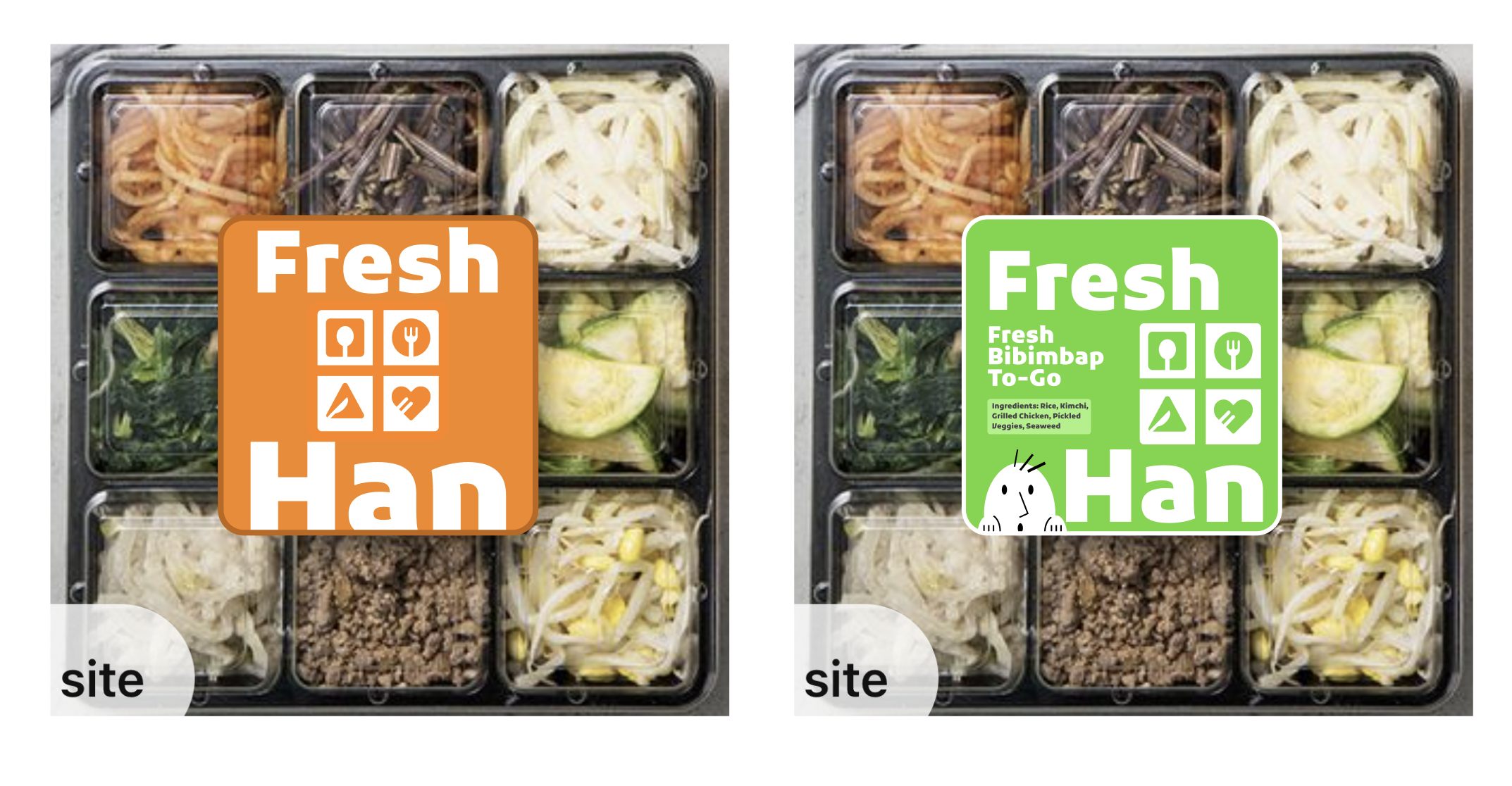
Today I am going to finalize the logo designs for Fresh Han & Fresh Sushi. These are some mock-ups and iterations from yesterday:
These two logos need to have a similar vibe to each other so many parts of the logo will stay the same.
3/21/2025
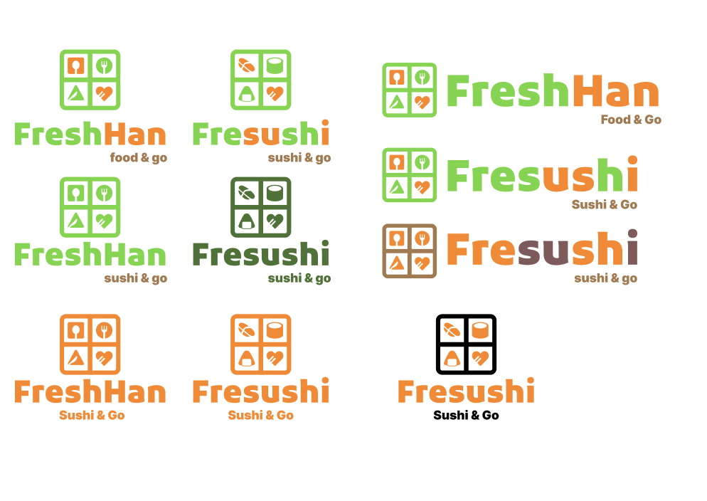
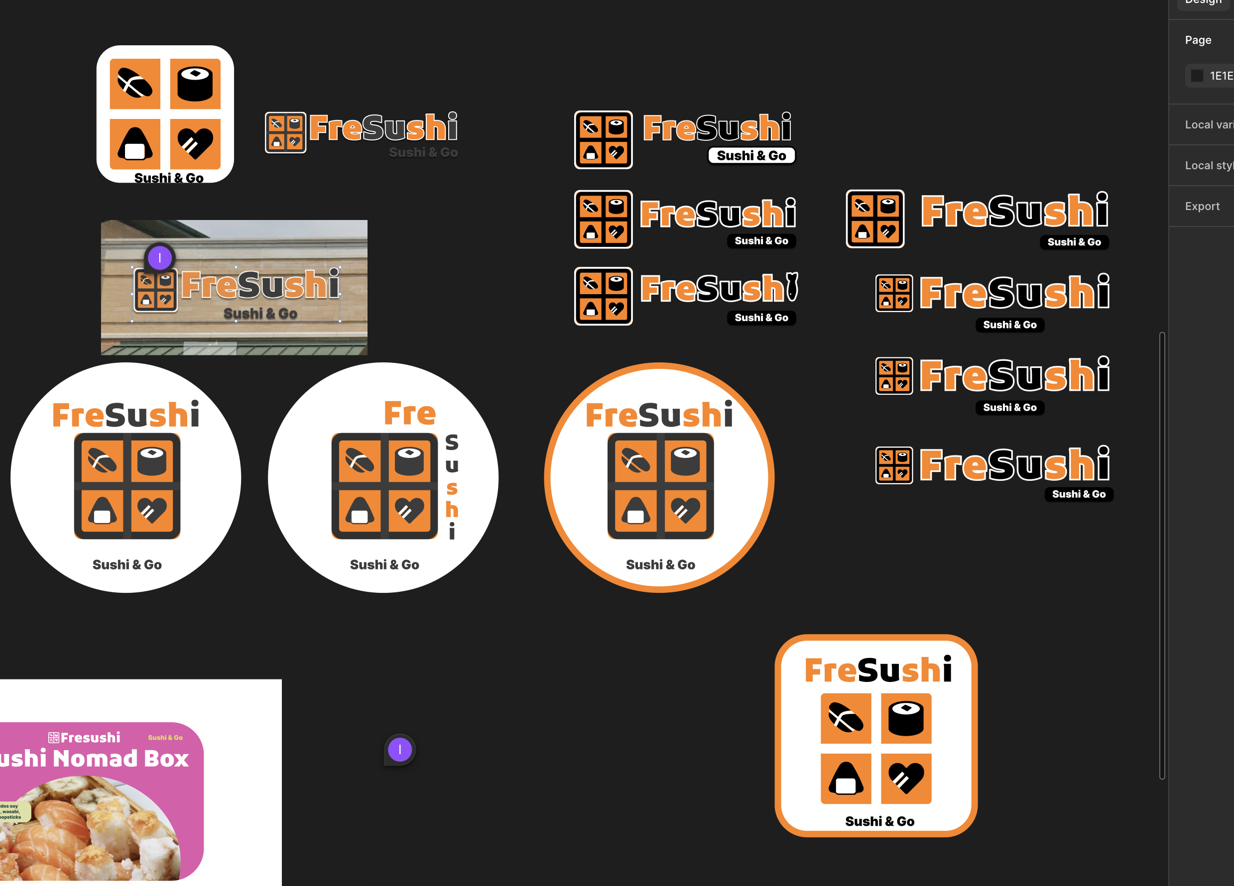
Today I am going to do three things. 1. Refine the colors of these two logos and finalize them. 2. Make some mock-ups to see them in different lights 3. Create a brand mascot for each. Here is where I left off from the previous session in terms of the logo development:
In terms of the mock-ups, I am going to do something vibrant and fun because these carry-on foods should feel youthful like you are grabbing a lunch bag that your mom made when you were 7 but you are now 35 and reliving that moment at the O’Hare Airport with our grab & go’s.
3/24/25
Today, I am going to design the trifold menu for Fresushi.
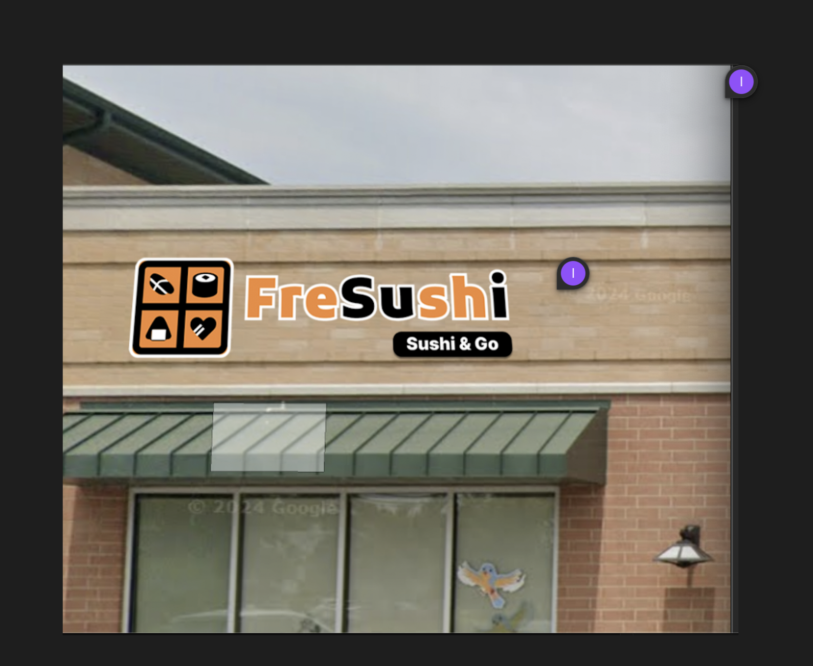
For the previous session, we tweaked the logo for Fresushi and finalized the logo for it and tested out how it would look outside as the storefront signage in Photoshop:
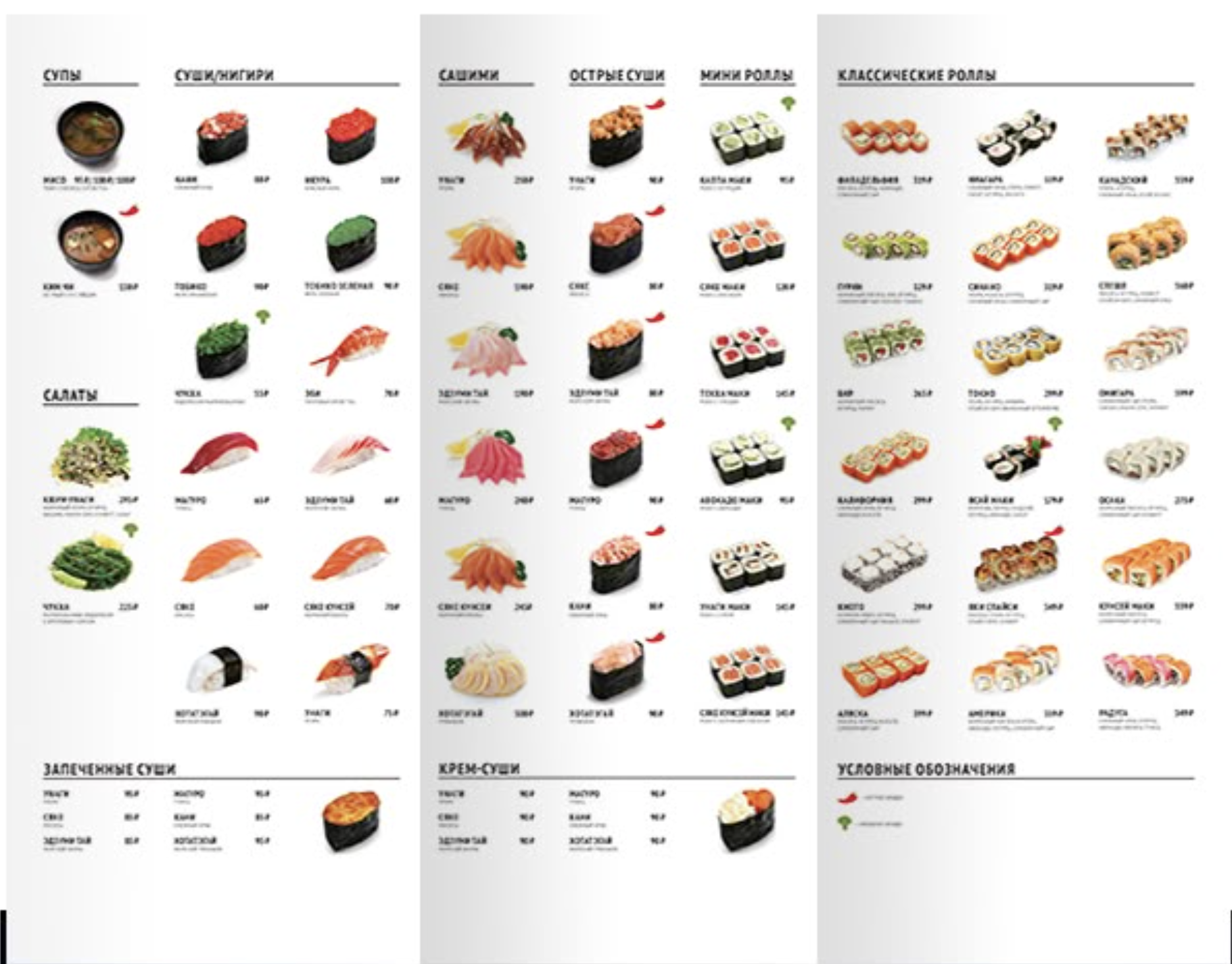
For the menu, we are trying to make something like this:
3/25/25
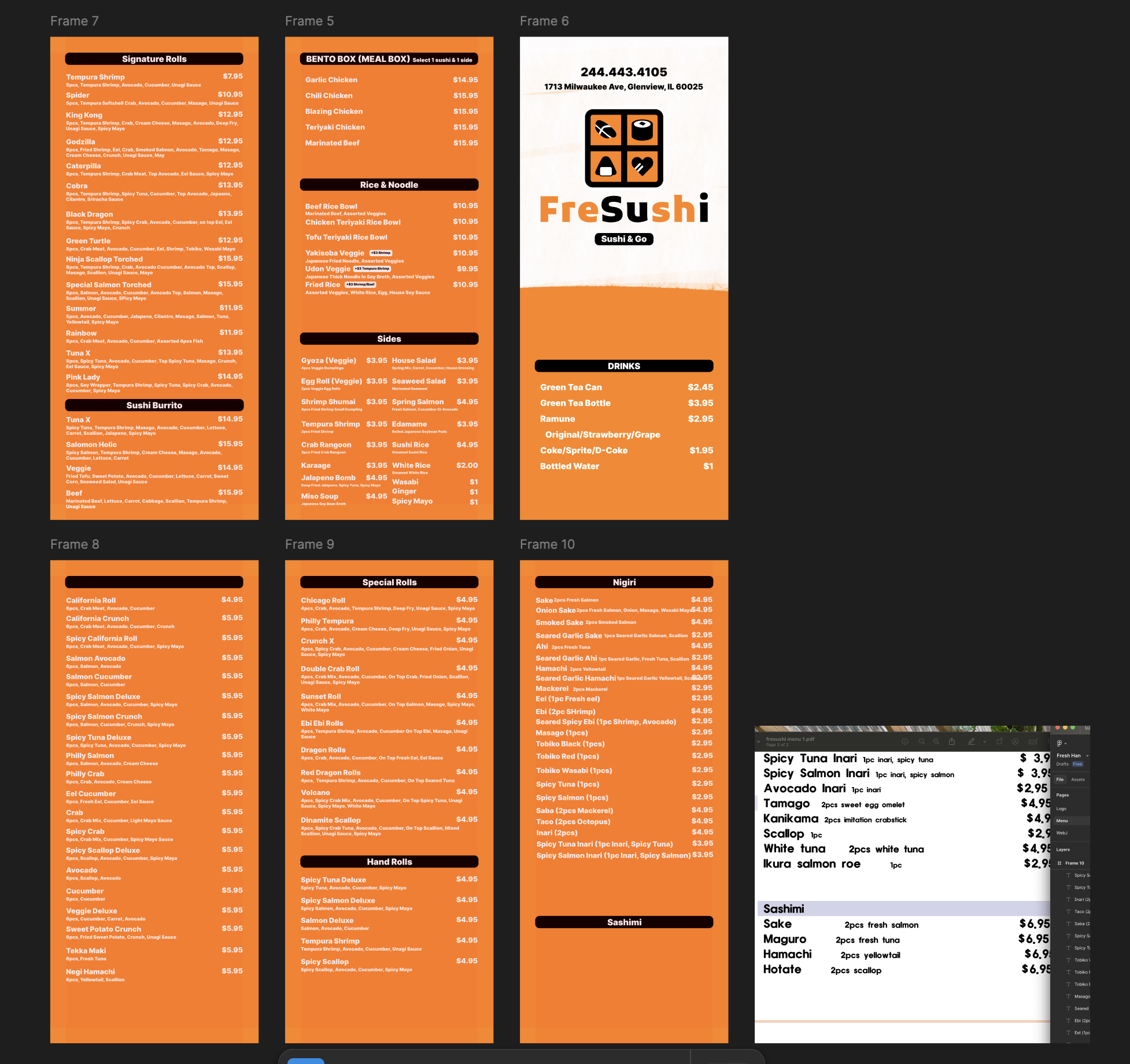
Today I am going to finish up Fresushi brochure menu. Here is where I left off:
Its got many items and that’s the only thing I can say.
My next steps are 1) finish putting all the items (almost done), 2) work on spacing 3) work on styling a bit and 4) put some corresponding illustration for each category.
