Fresushi
3/26/25
I made a new journal page for Fresushi (previously under Freshan) because these two deal with different business items and locations.
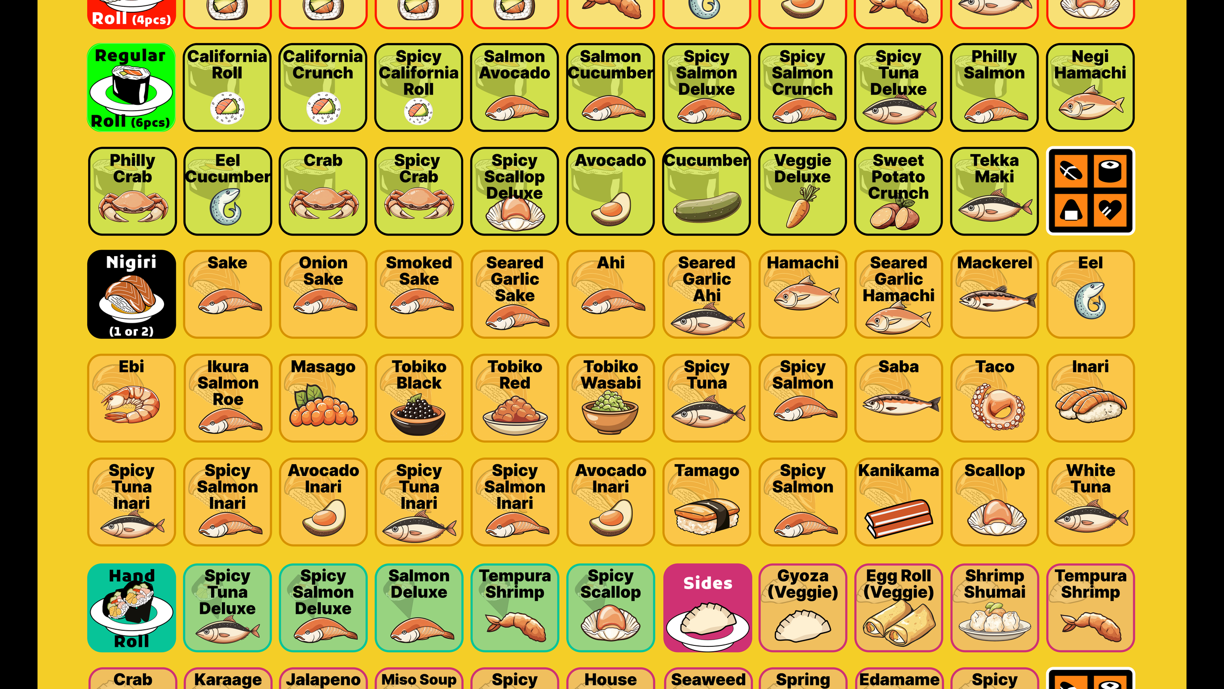
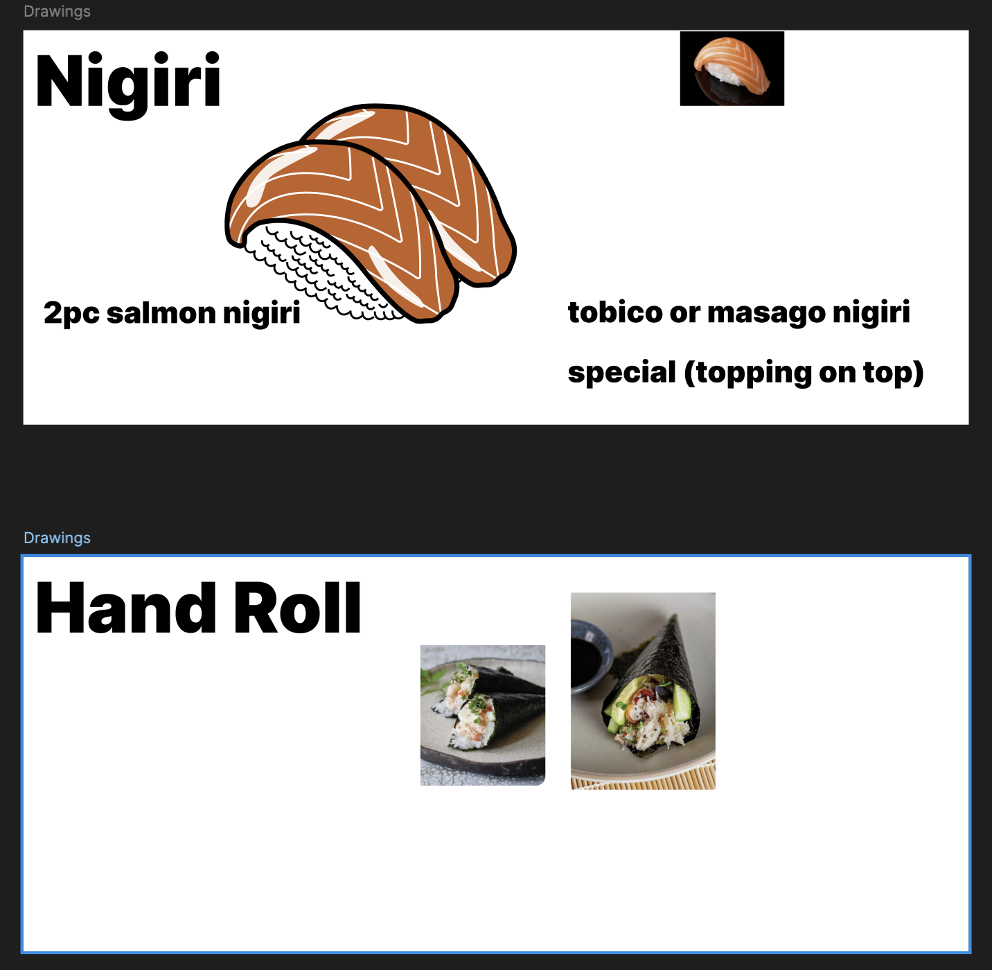
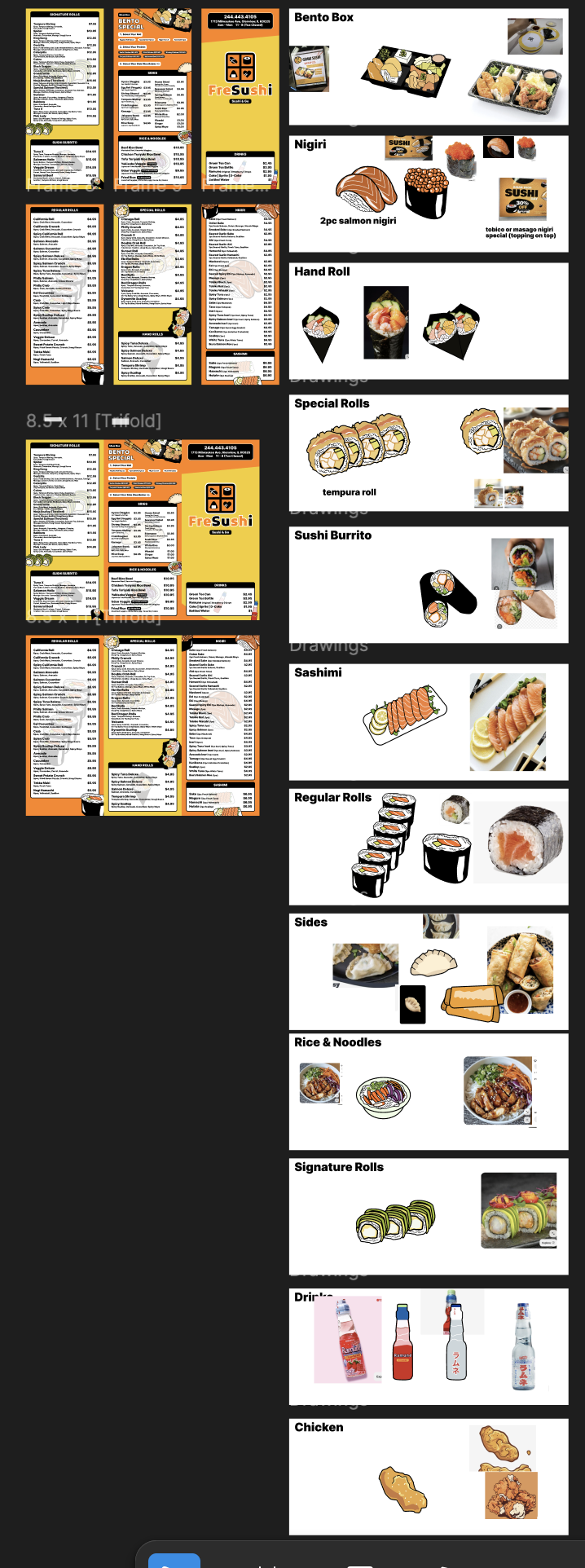
Today, I am going to be drawing some sushis for its brochure menu. This is the vibe the owner is going for: something fun and bold.
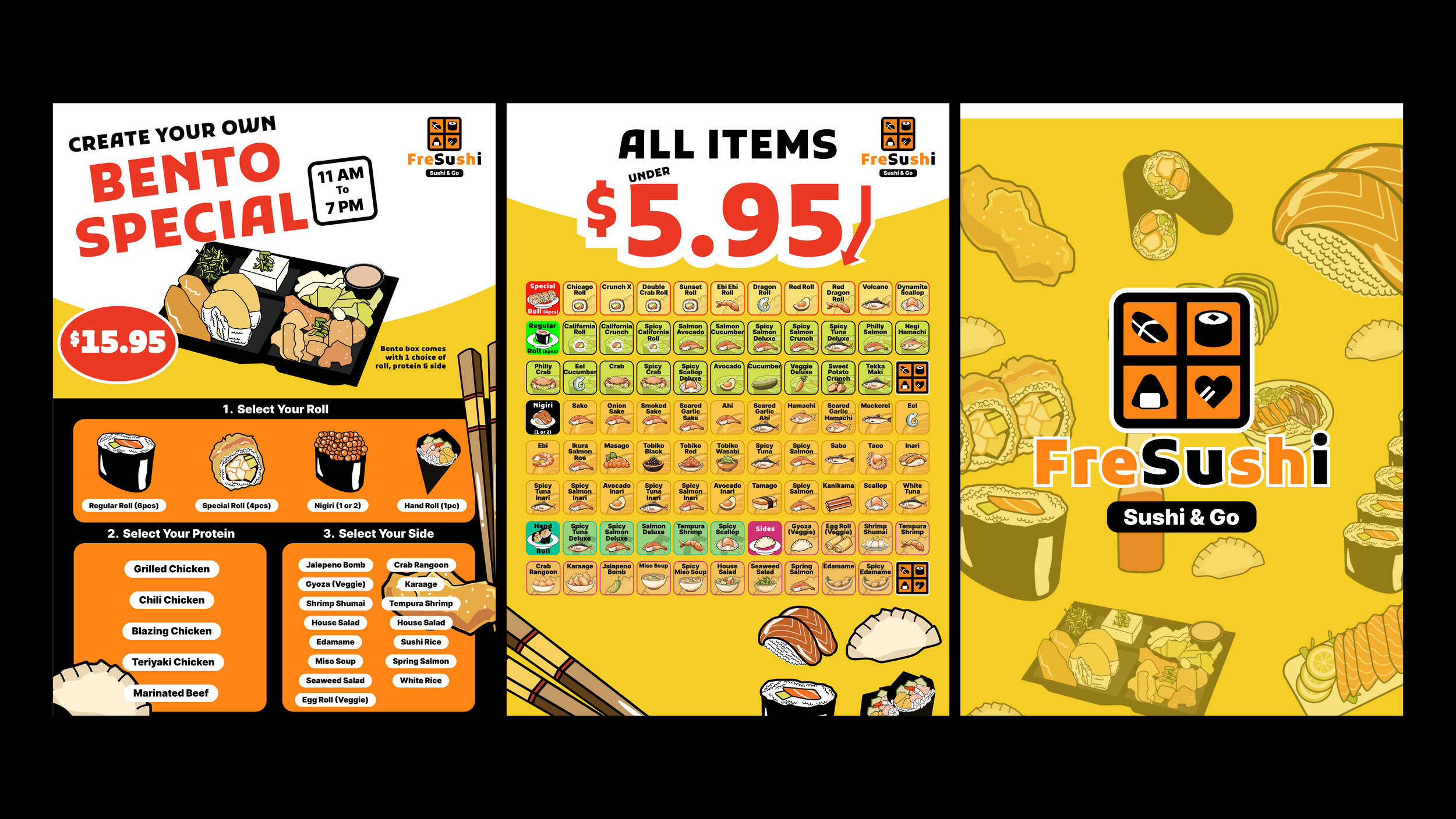
This is where I left off last time with the menu & the drawings:
3/27/25
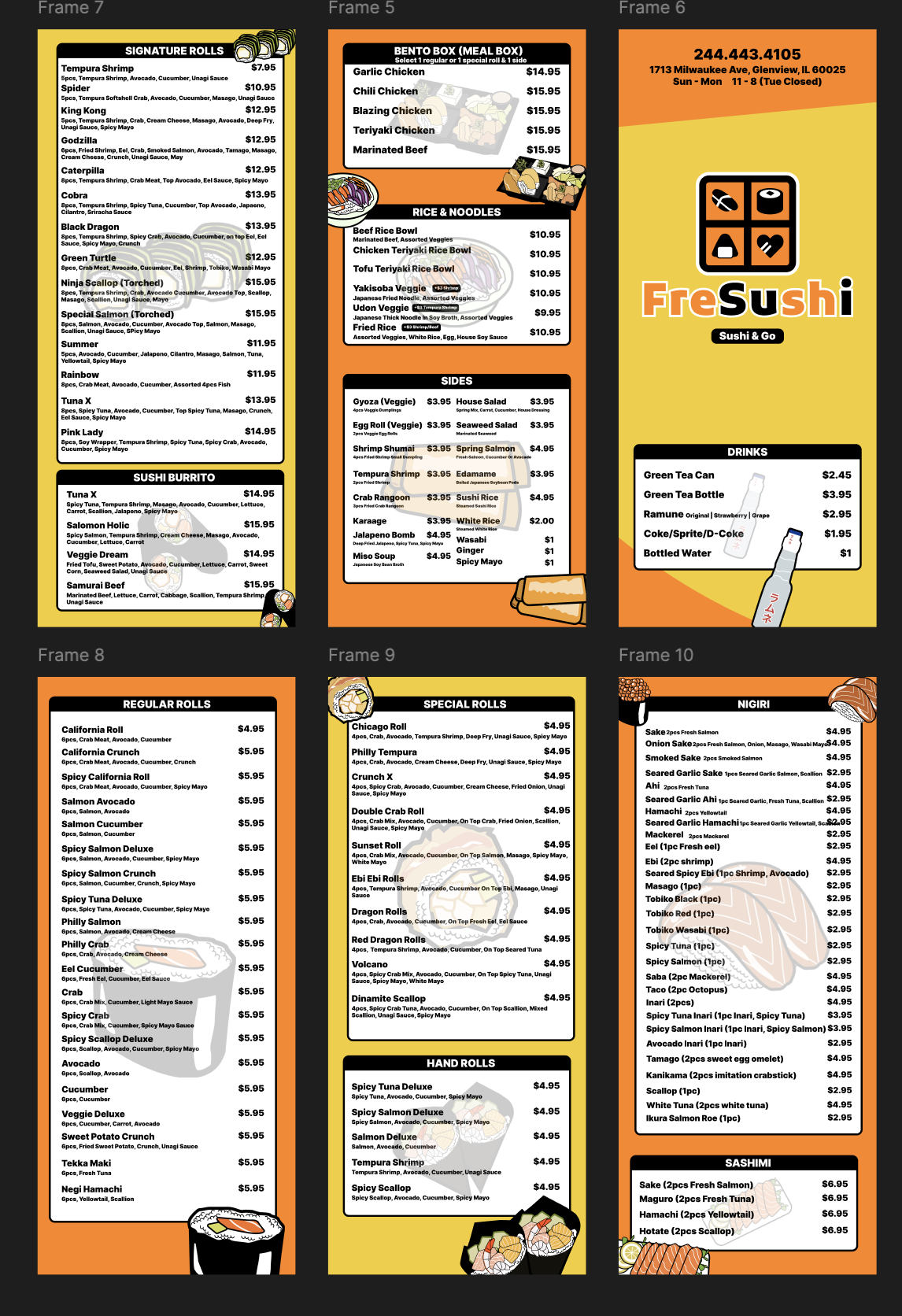
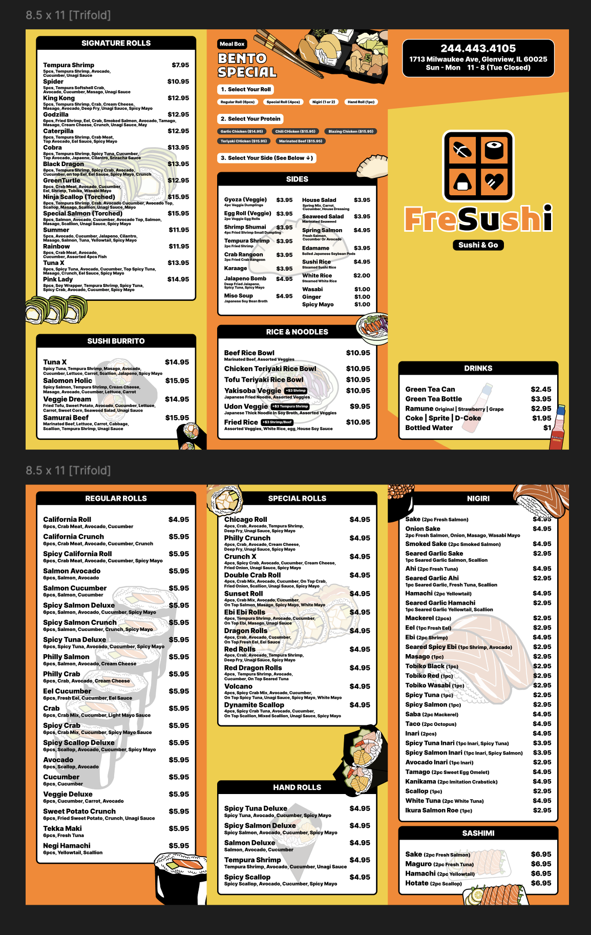
Today I will be finishing off the menu with all the drawings.
Yesterday I explored another logo convention that looks like this:
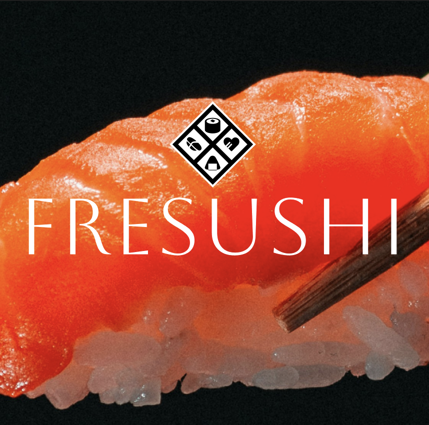
I like this logo as it’s giving a more serious but elegant vibe like an expensive sushi restaurant that happens to be pretty chill.
Anyways, for today I am going to finish the menu with the orange and yellow color scheme that’s gives off a more fun vibe.
3/28/25
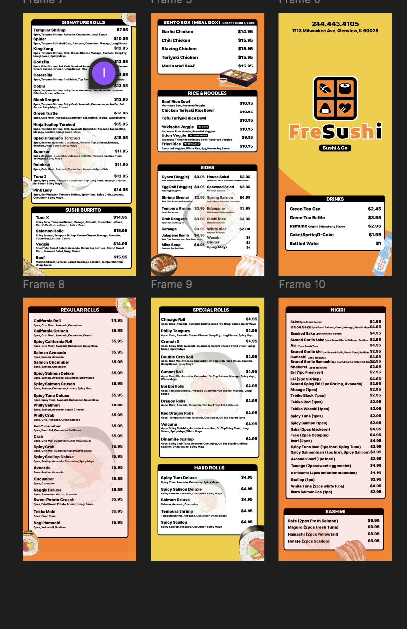
Today, I will work on spacing and tweaking some minor things for the menu I’d created yesterday:
It turned out to be pretty iconic in its own way.
A couple of days ago I thought a sushi brand needs to give off a formal and pricey vibe to tell the customers we really do sushi good.
But I think this kind of vibe can work as well because everyone loves sushi and this is definitely an everyone vibe.
3/31/25
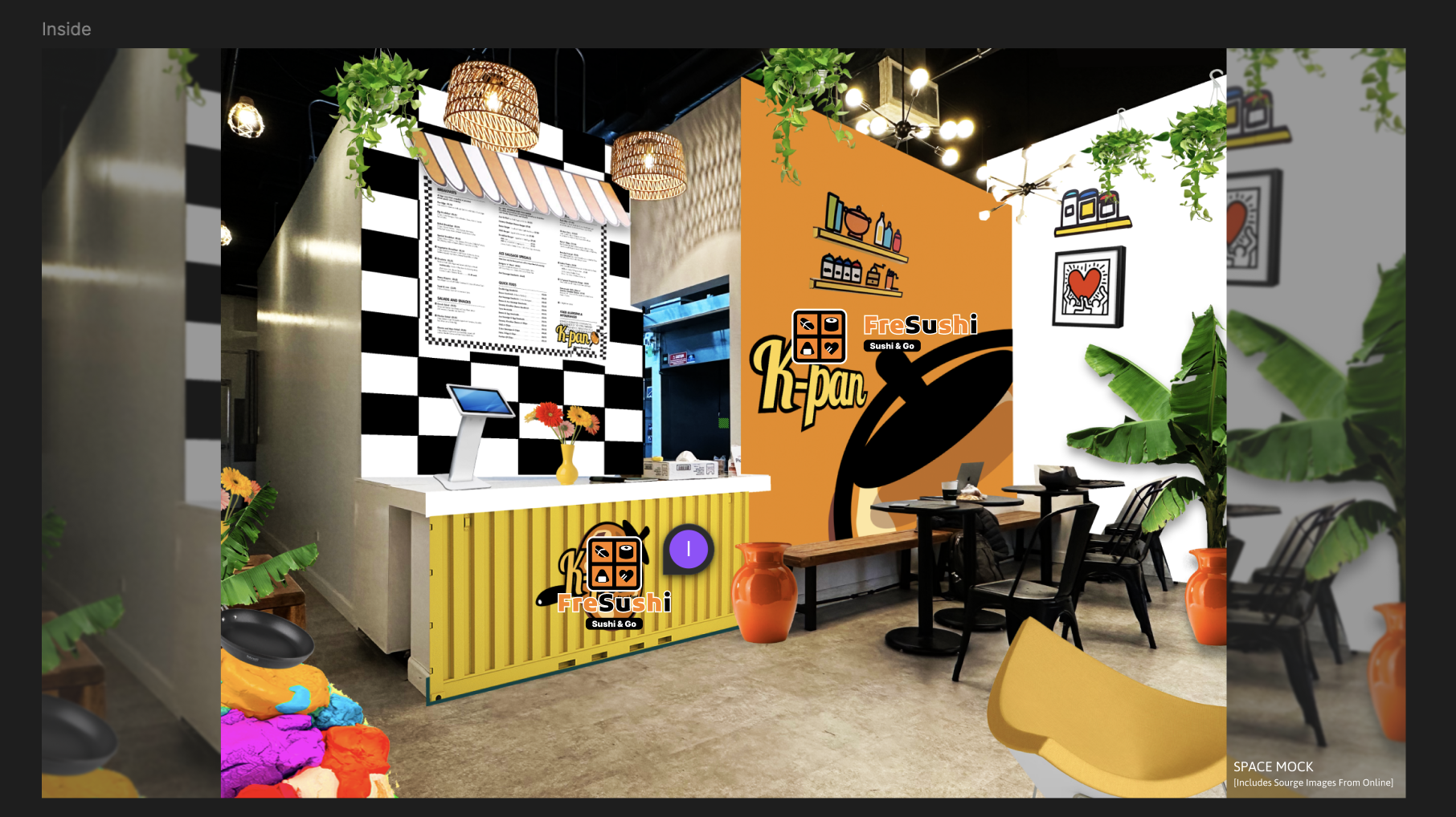
Today I am going to work on spacial graphics for Fresushi & maybe as I do that I can perhaps use Rhino to push myself as a designer with interior designs.
Here are some other things that were designed thus far:
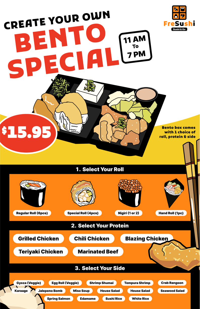
Brochure Menu & Sushi Drawings:
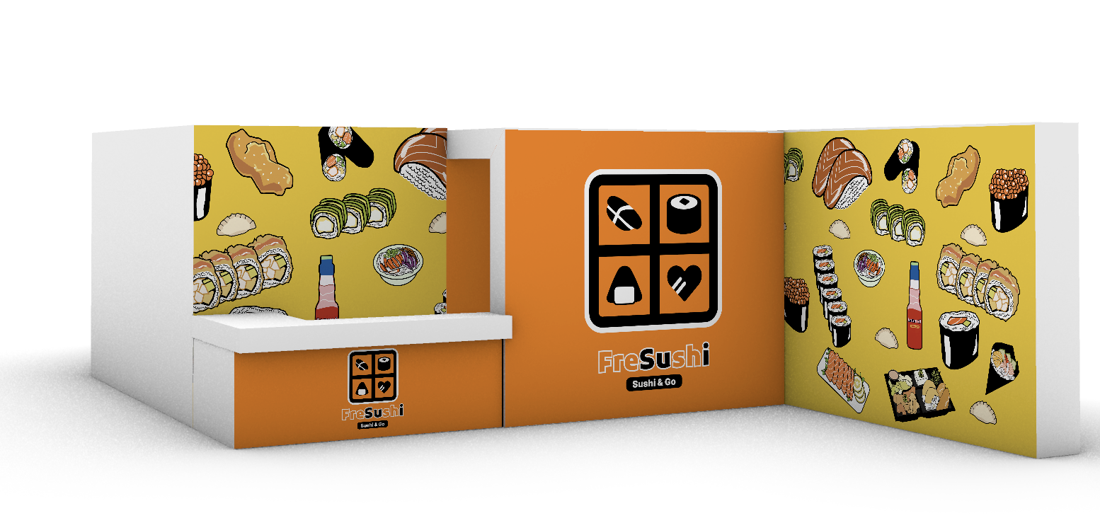
Outside Window Banner 1:
For the space, we are renovating this cafe space and below is a concept of the cafe space for the previous brand an the current state in Rhino:
4/1/25
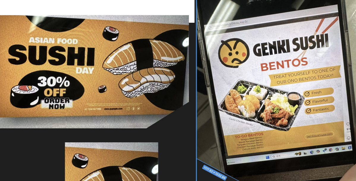
Yesterday, I made some adjustments to the brochure menu and refined the outside window flyers with some Midjourney illustrations. Here is how it looks for the flyers: