Grill House
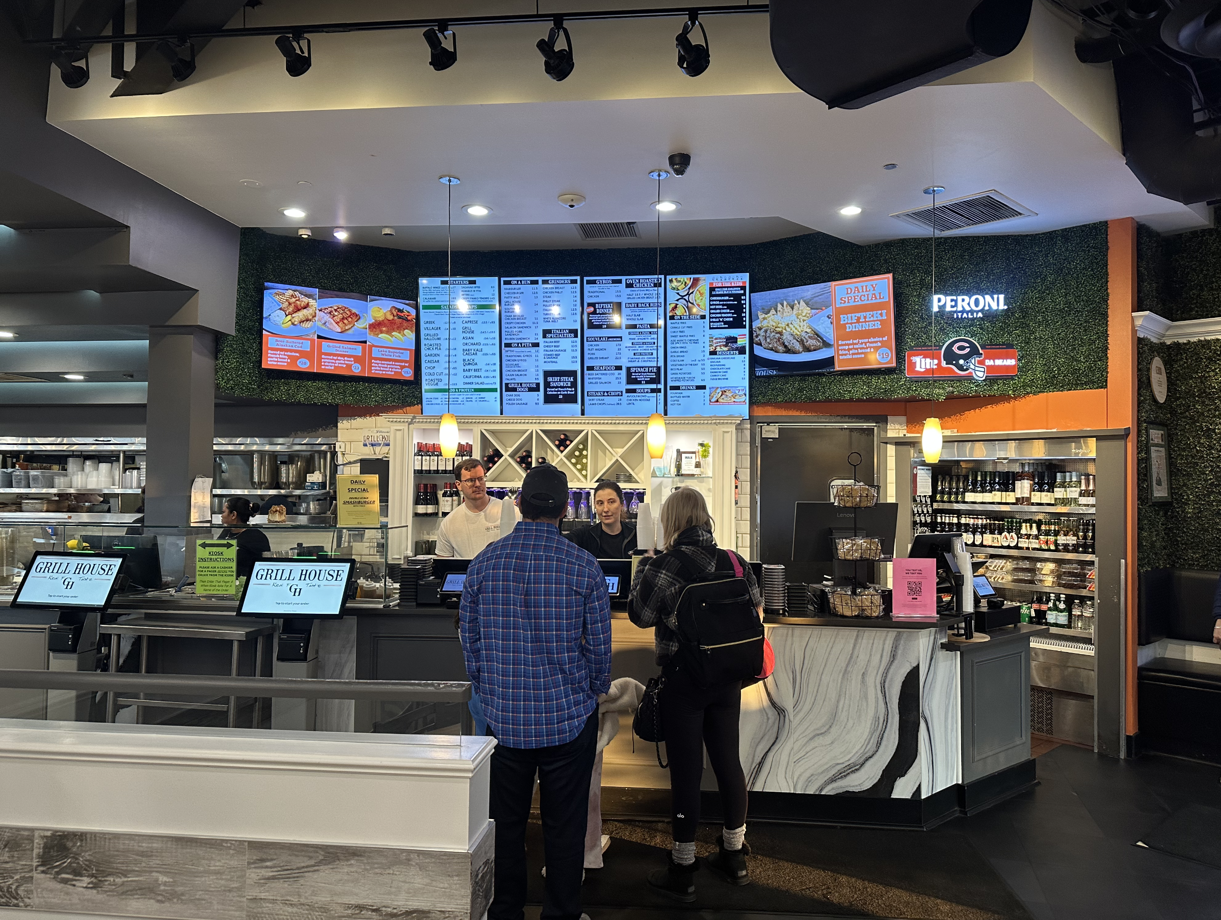
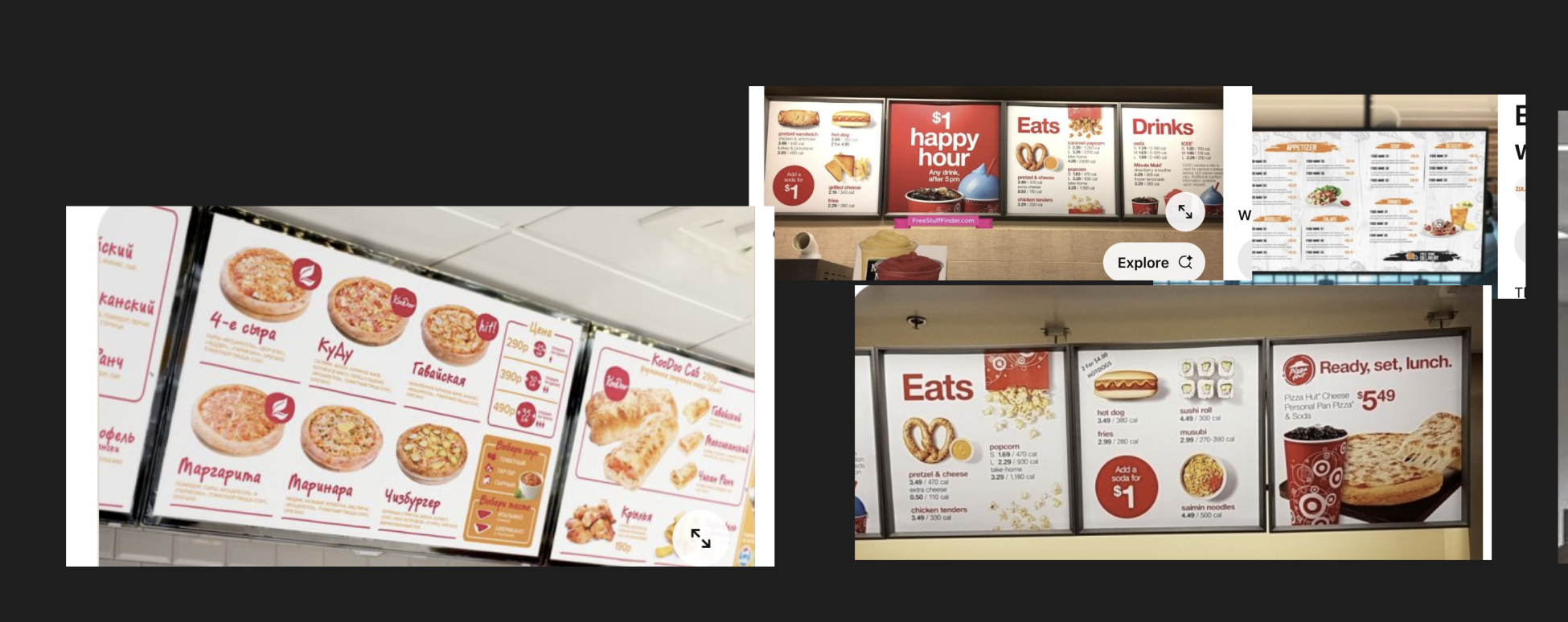
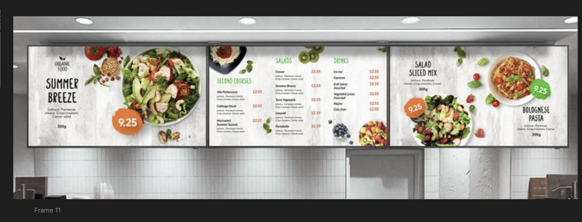
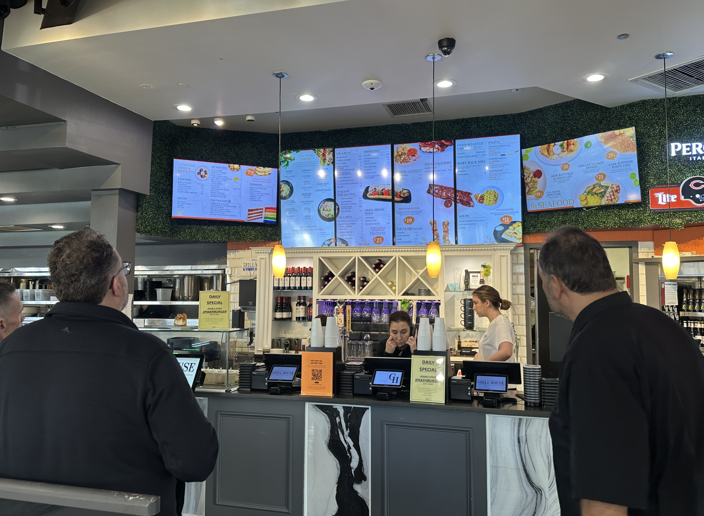
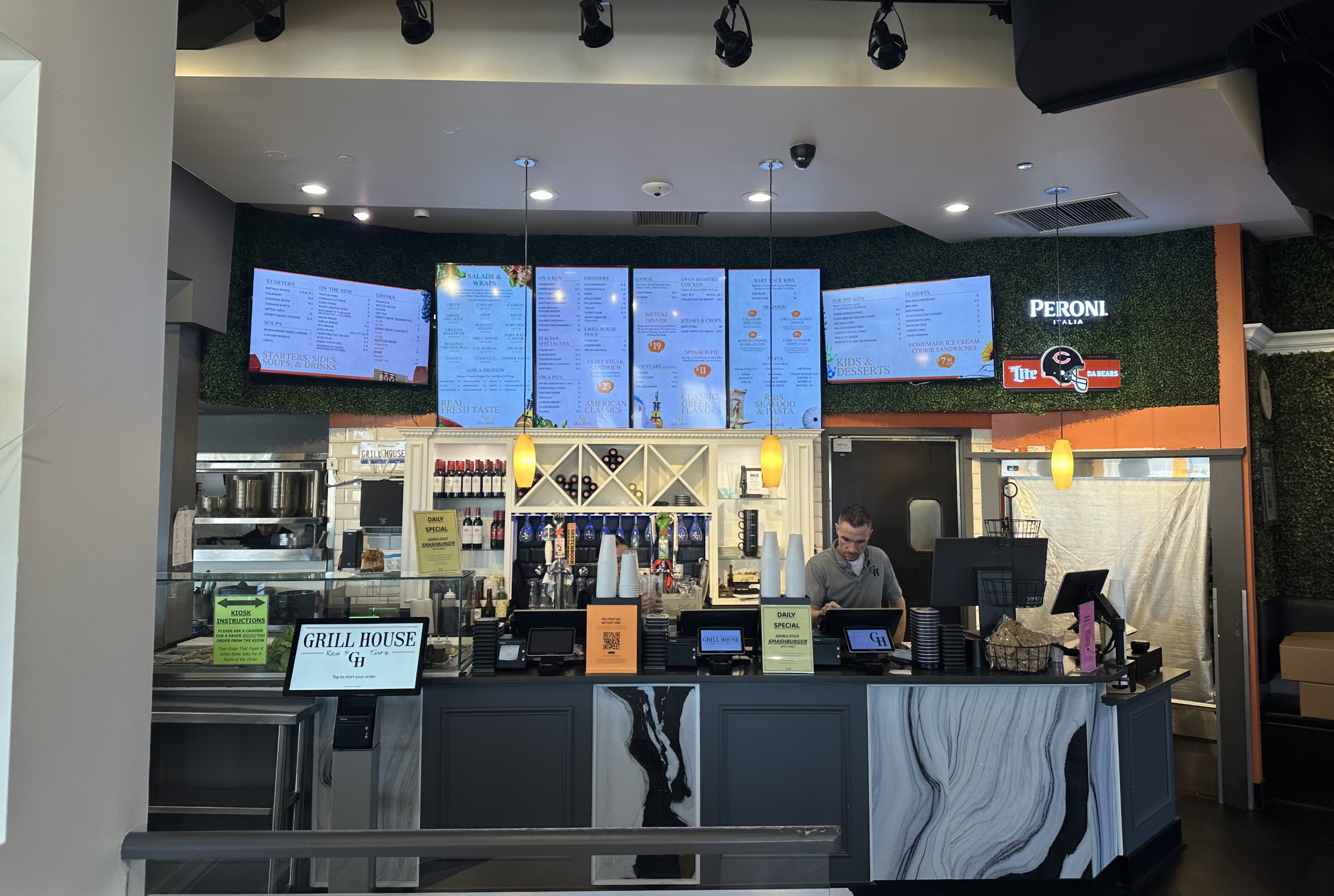
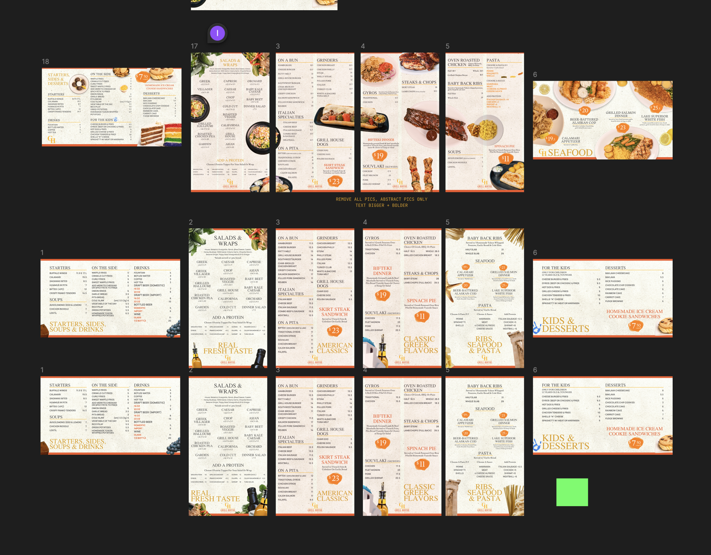
Today I need to finish their TV menu and then start thinking about the designs for the space.Here is how the current menu looks like (ones that they already have):The new TV menu according to the owner needs to look clean, fresh & look like a collage so it reads horizontally across and seem connected to each other in some way.So these are some inspirations I’ve gathered:First Iteration TV Menu
Here is how the new one looks like:Second Iteration
Today, I am going to make changes to the first one.Some new menu items were given to me and also the owner wants some changes to the design:It needs to feel less fast-foodish so more abstract with images and more luxurious vibe.The fonts can be larger to be more readable.
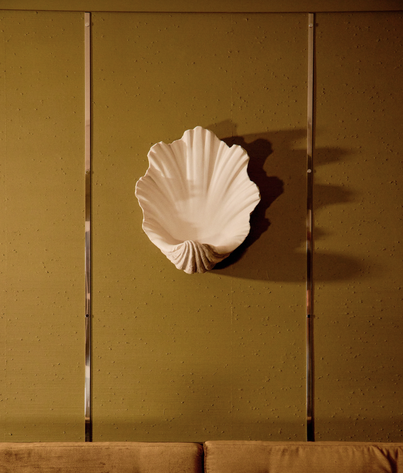
Thus, Today, I am going to look up some images that are from Yatzer (an interior design website) to take some inspiration with their interior decorations (for example like a seashell on a wall for seafood vibeHere is how it turned out:
Now, I am going to tweak them a bit.Here are some changes overall I made to the menu thus far:Interior Design
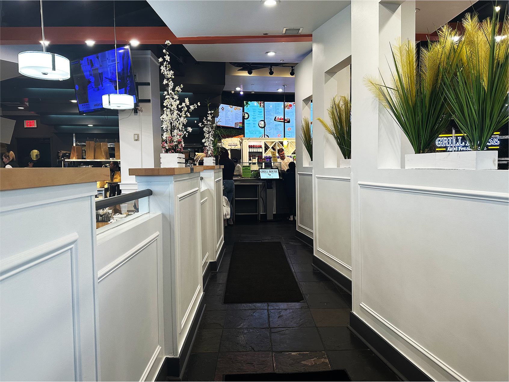
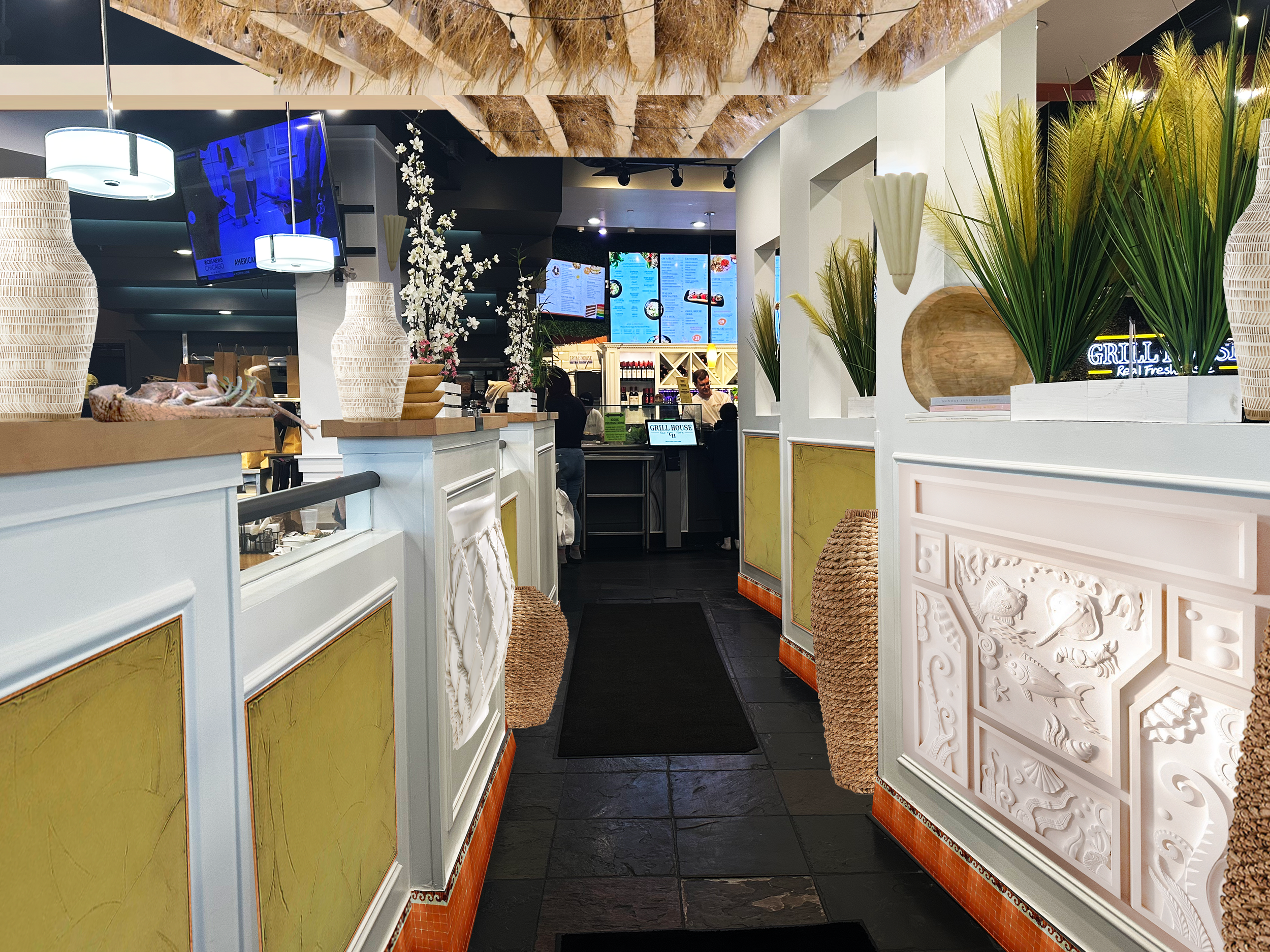
Then, I spent some time experimenting with the interior design of the space starting with the main walkway:Image sources from various websites on the Internet (Crate&Barrel, Yatzer, etc.)
Physical Menu
Today, I am going to work on that.The physical menu.
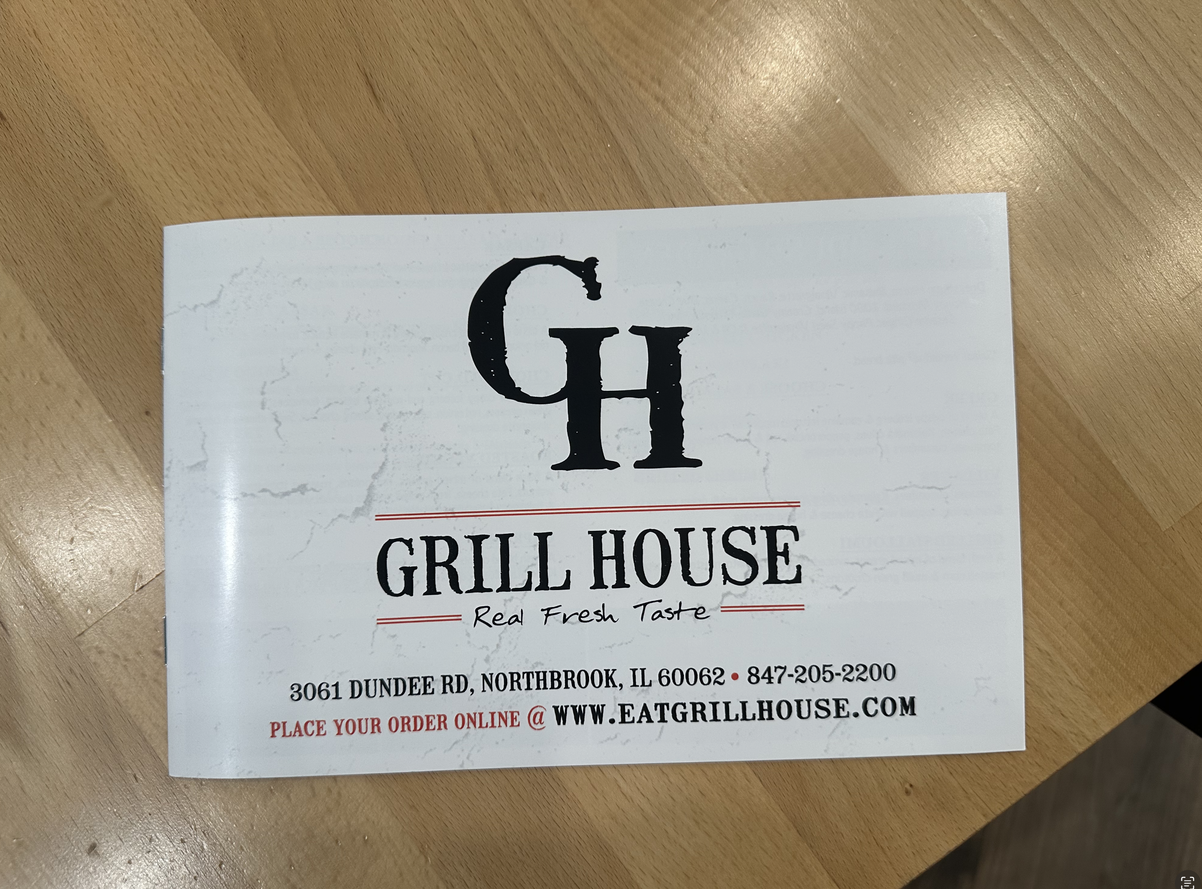
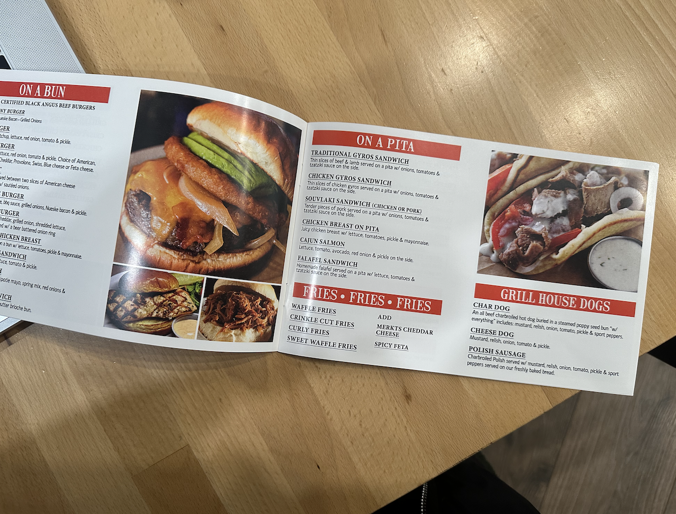
Currently, it looks like this:
I don’t know the size of this menu above but I like how it looks like a book which I haven’t designed in a while.
Just looking at it though, it has many pages.
I wonder if I could reduce the number of pages for a quick-read vibe.
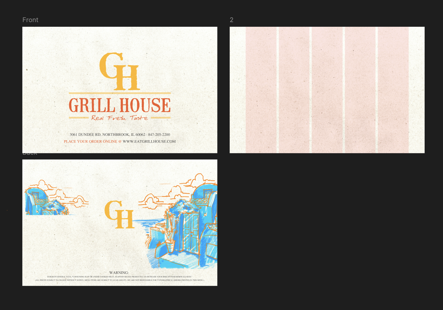
Here is where I am with the menu:
Just a little bit of front and the back in progress.
For the rest of the menu-item pages, I can definitely copy the layouts done for the other restaurant (BYG) which all had horizontal screens.
Mobile App Ad
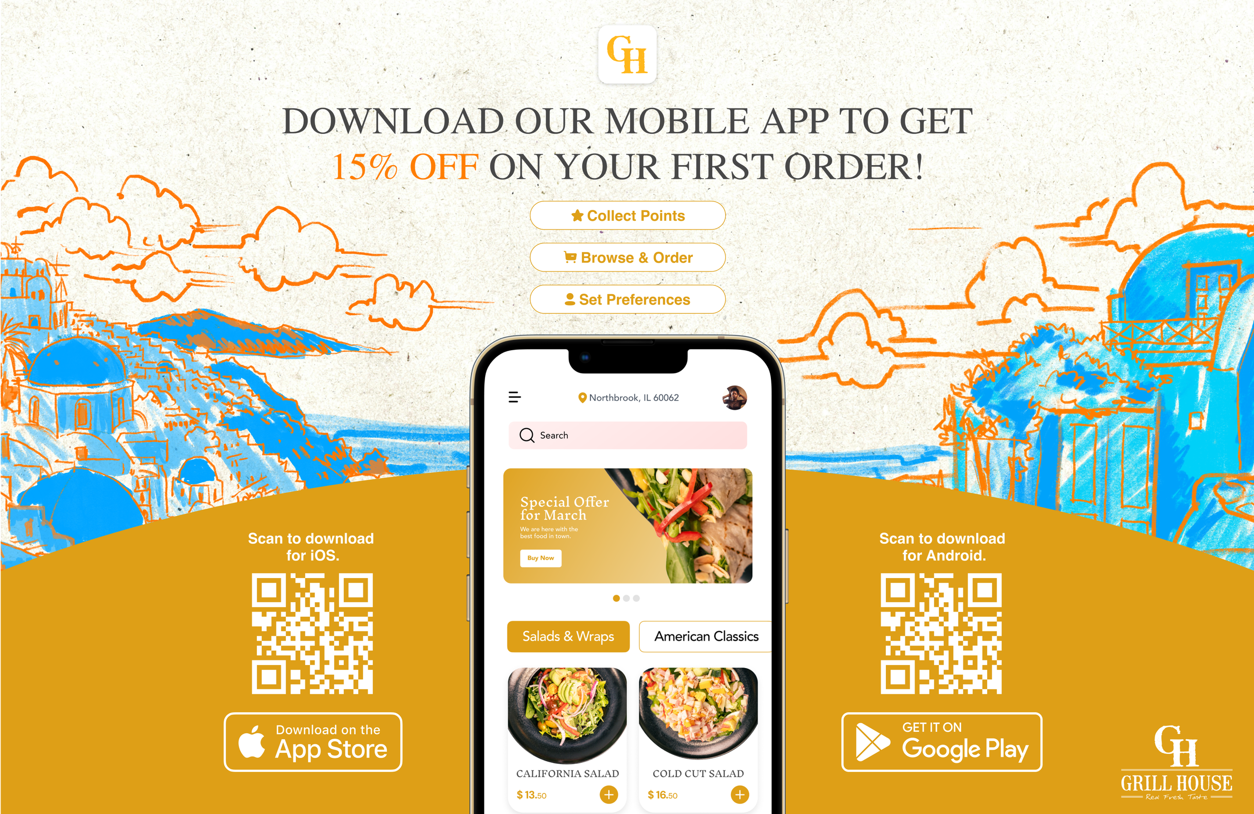
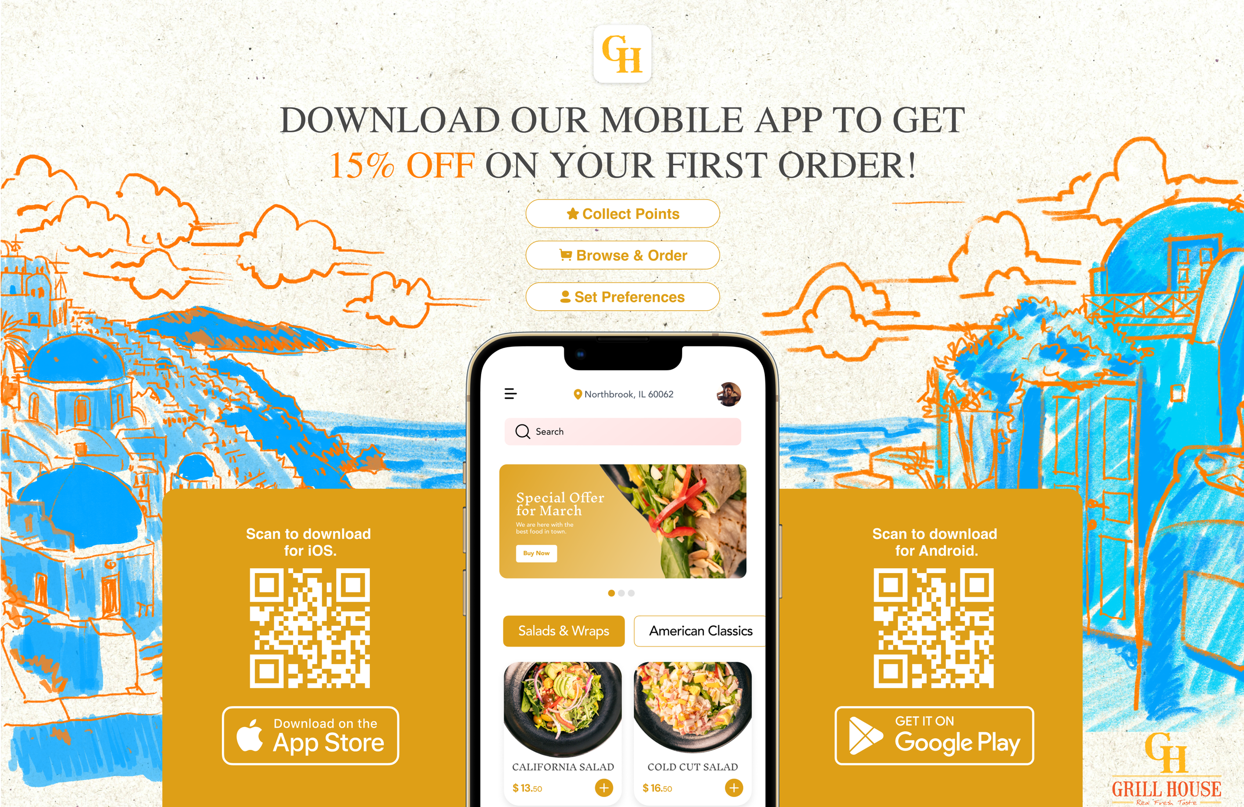
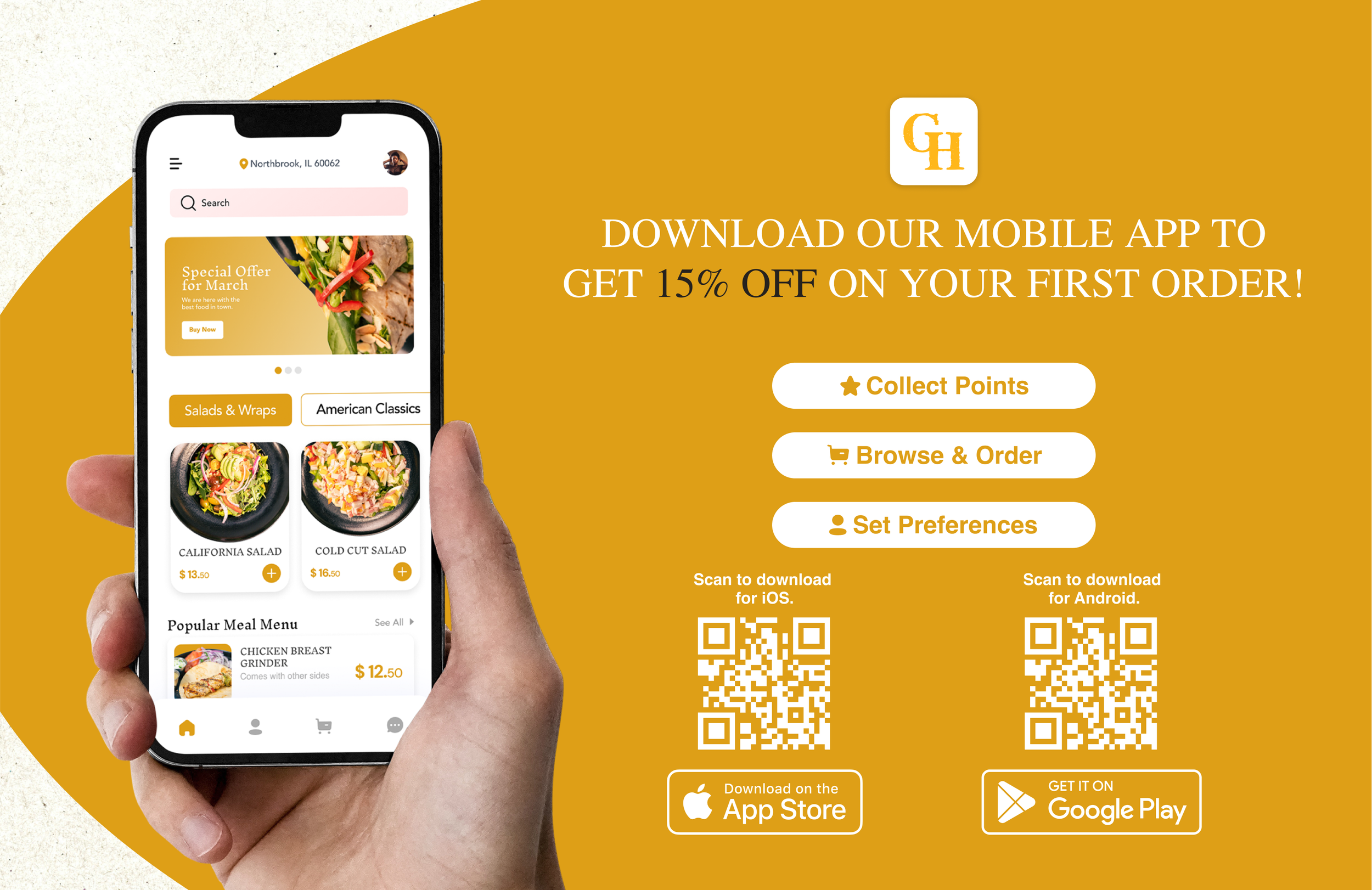
As I was working on the back cover of the paper menu, we decided to use that page to advertise the mobile app that is coming out. Here are some layouts I created:
Paper Menu
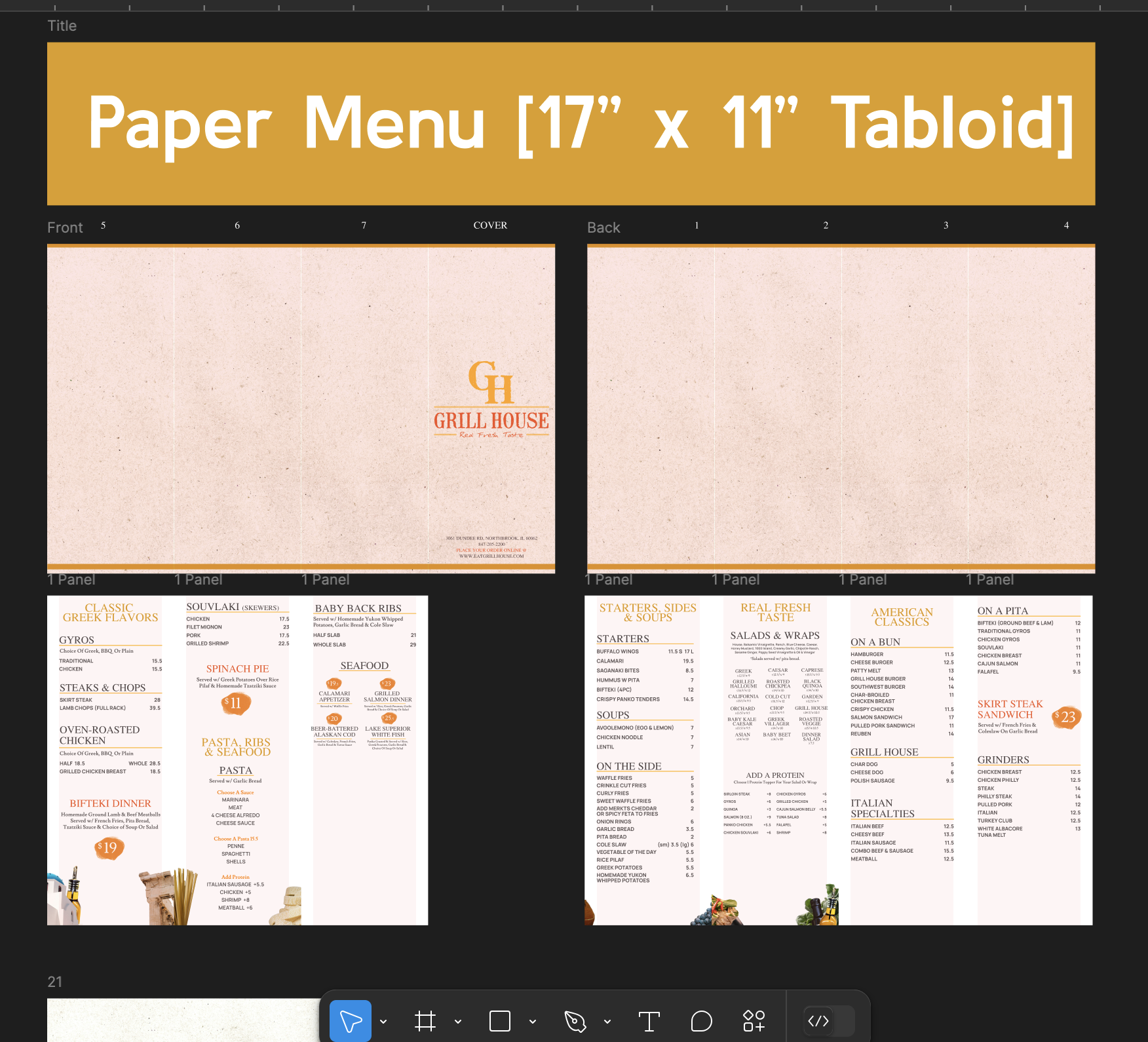
Paper menu again! Today, I am going to finish the tabloid paper menu for this restaurant which currently looks like this:
I just gotta play with the spacing a bit and I am good to go.
With menu, I like how it turned out pretty well so far just by moving different sections from the other format of the paper menu (the booklet one).
Because I designed the mobile app ad for the paper menu, I am curious if I could do that as well here.
Paper Menu
Here is how the paper menu, the booklet format, looks like right now:
I’m going to spend like 10 minutes checking for spacing and things of that nature and then tweak the back page a bit with the current mobile app we have so replacing the screen, icons, etc.
Looking at the above screen right now, the page 5 feels a bit empty so I might make images a bit larger or something.
