
One White Street
4/2/2025
One White Street is a neighborhood restaurant in Tribeca, NYC next to a cafe owned by its owner.
Today I was tasked to reimagine their paper menu that has not been changed for the past 3 years:
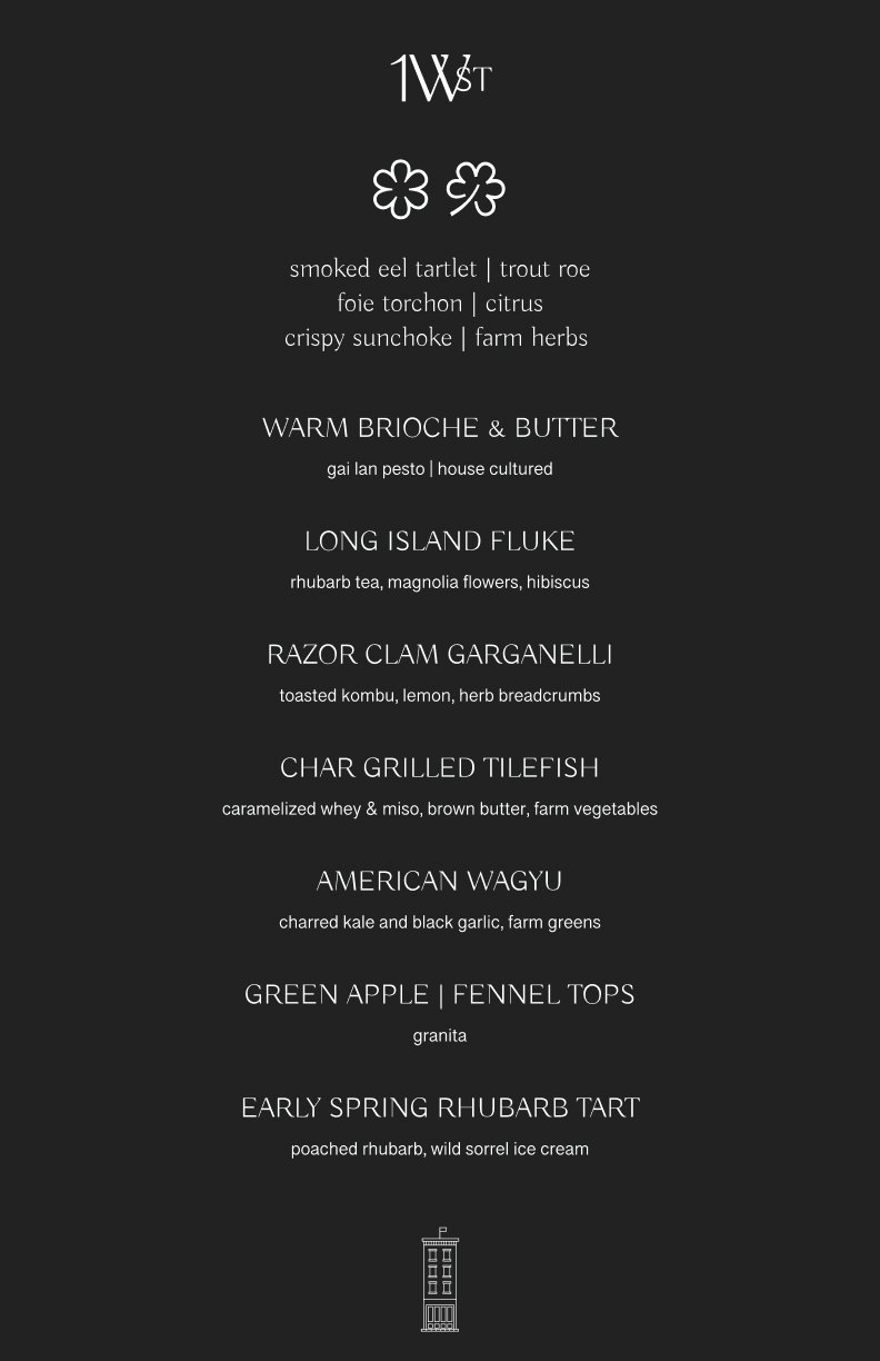
Left (Narrow One): Tasting Menu. Right: A La Carte Menu
Overall it’s a very simple and pretty menu that looks awesome.
After having a conversation with the owner, it was decided that we want to keep the serious tone to the menu but somehow think of different ways to format this menu, etc.
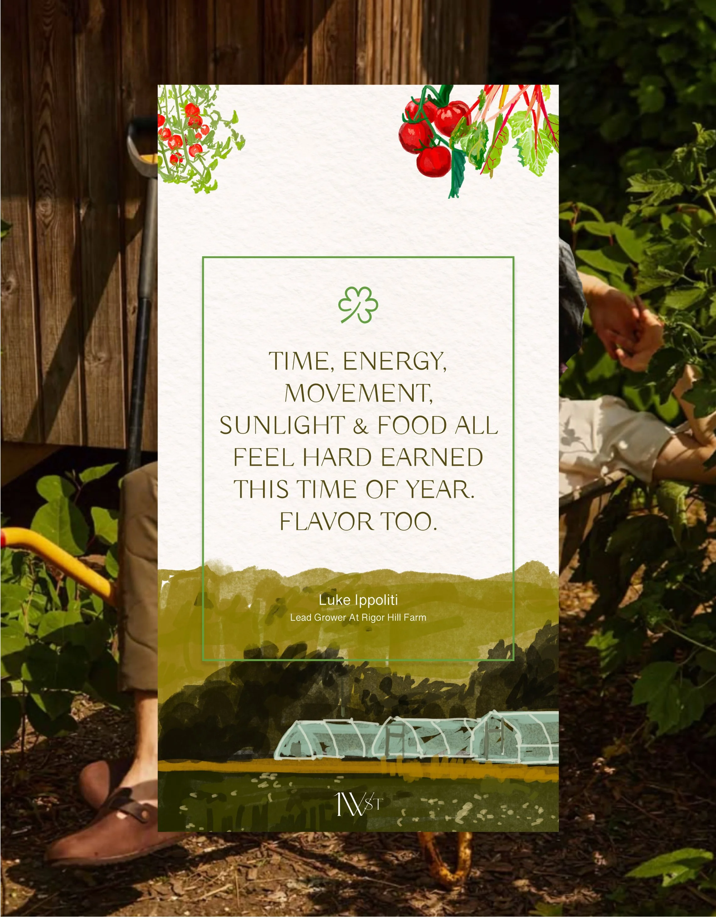
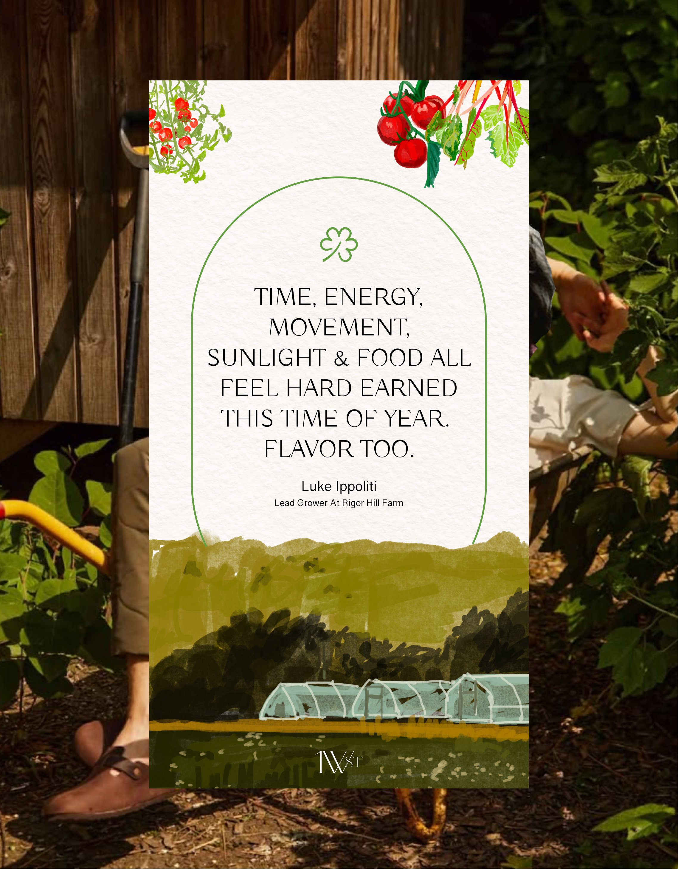
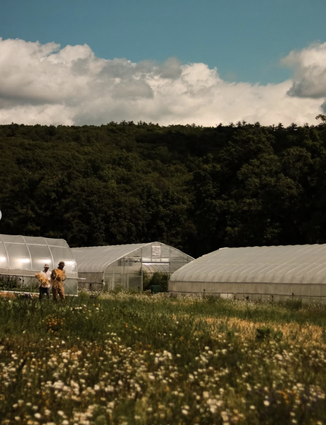
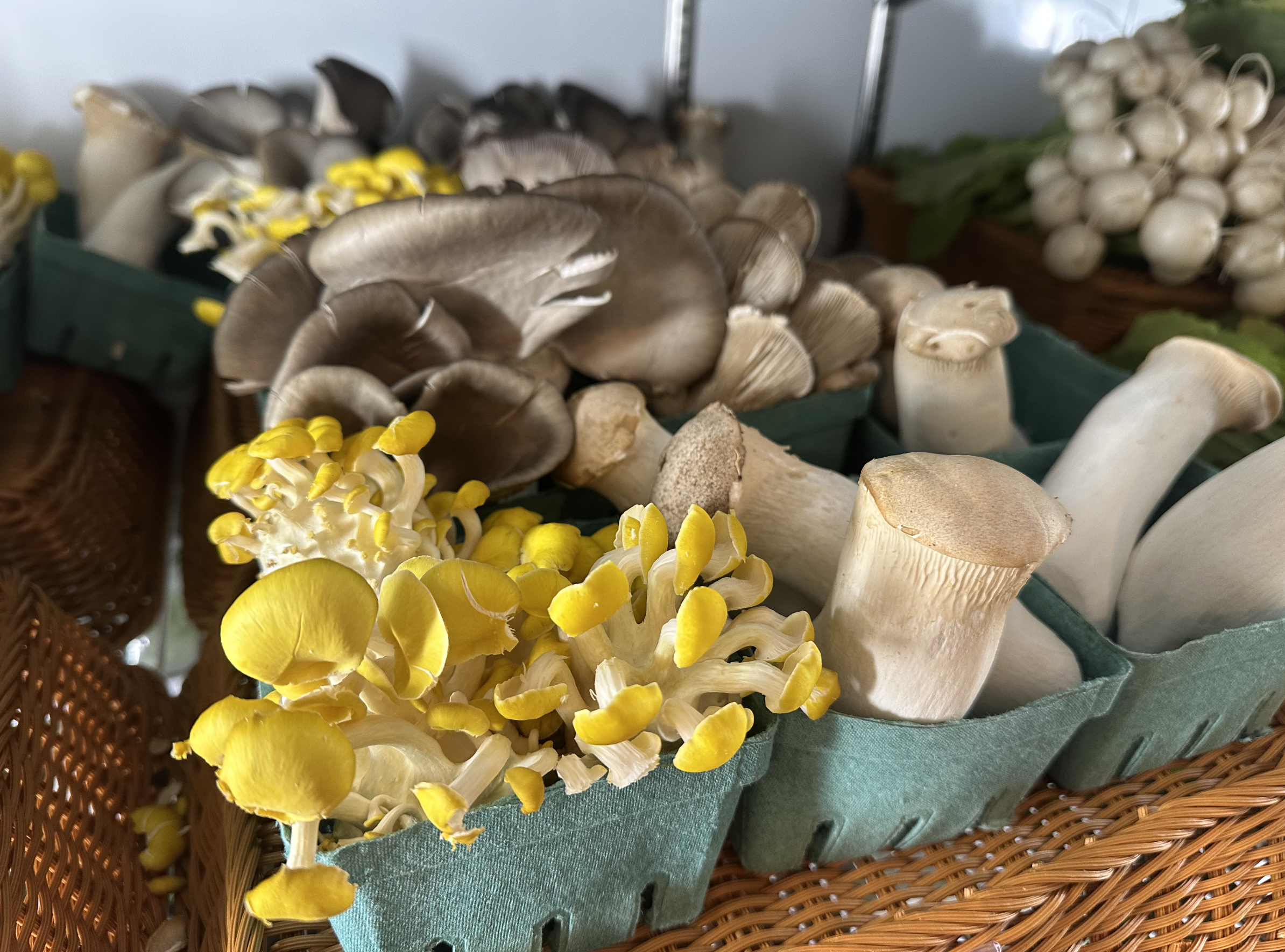
From the conversation I also learned that the team has their own farm in the Upstate NY to grow their vegetables.
So perhaps with drawings we could emphasize the vegetarian aspect more and the fact that they have their own farm which could be interesting.
4/3/25
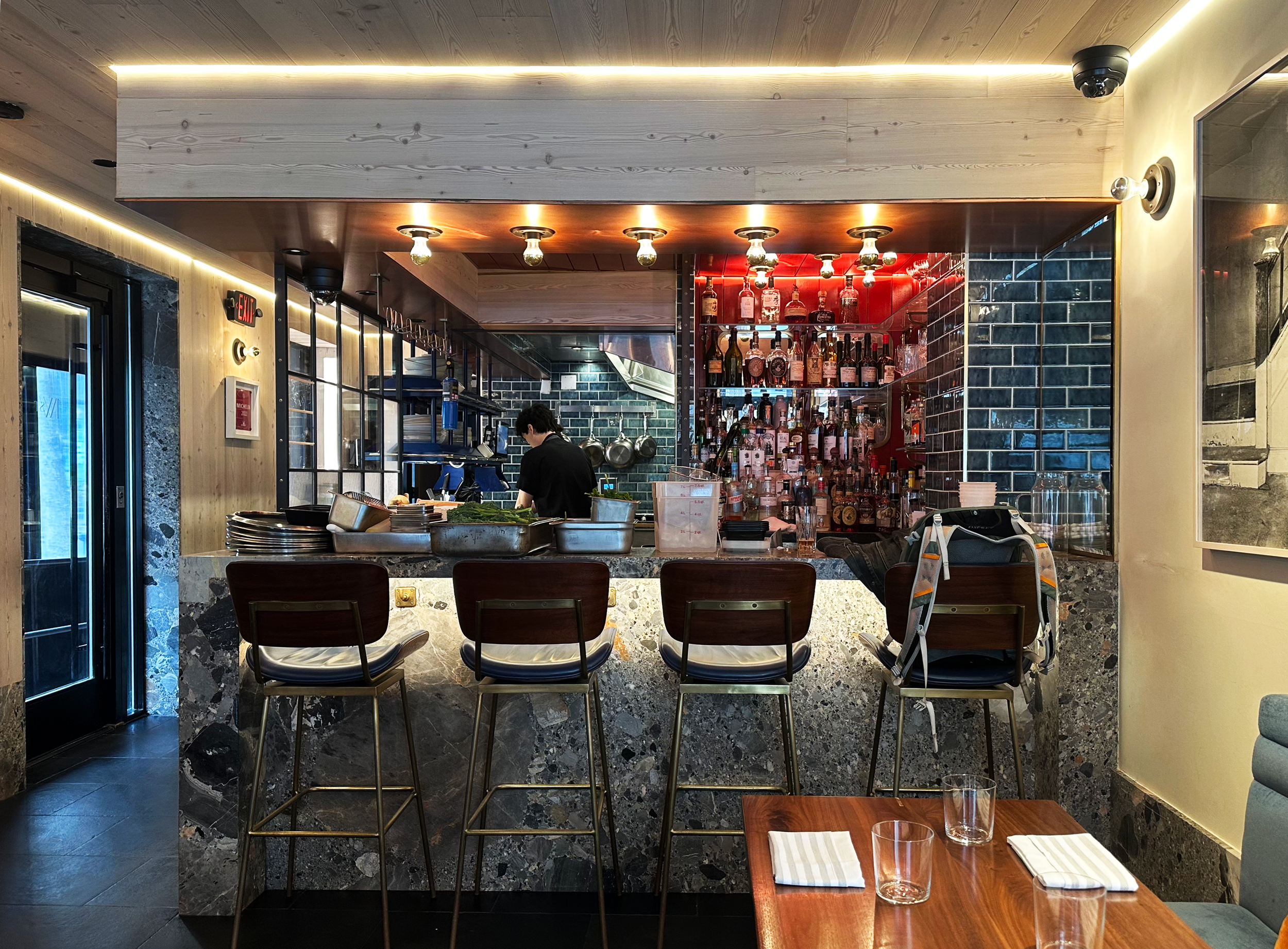
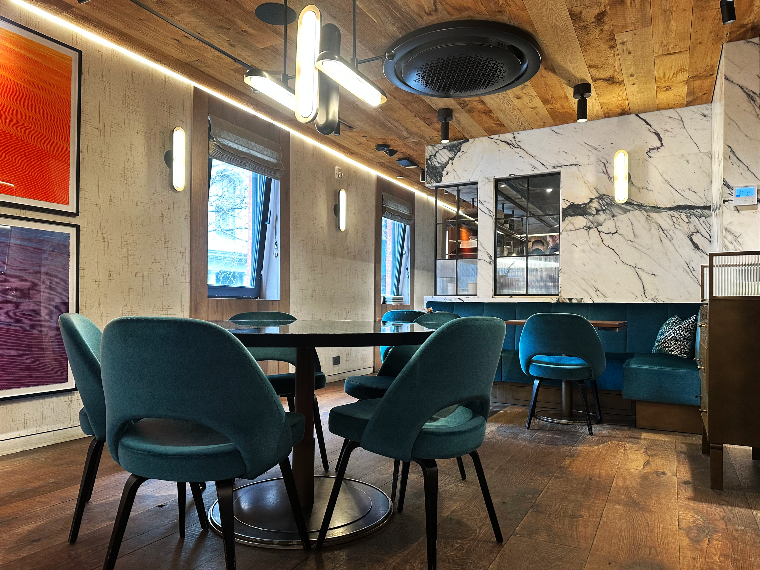
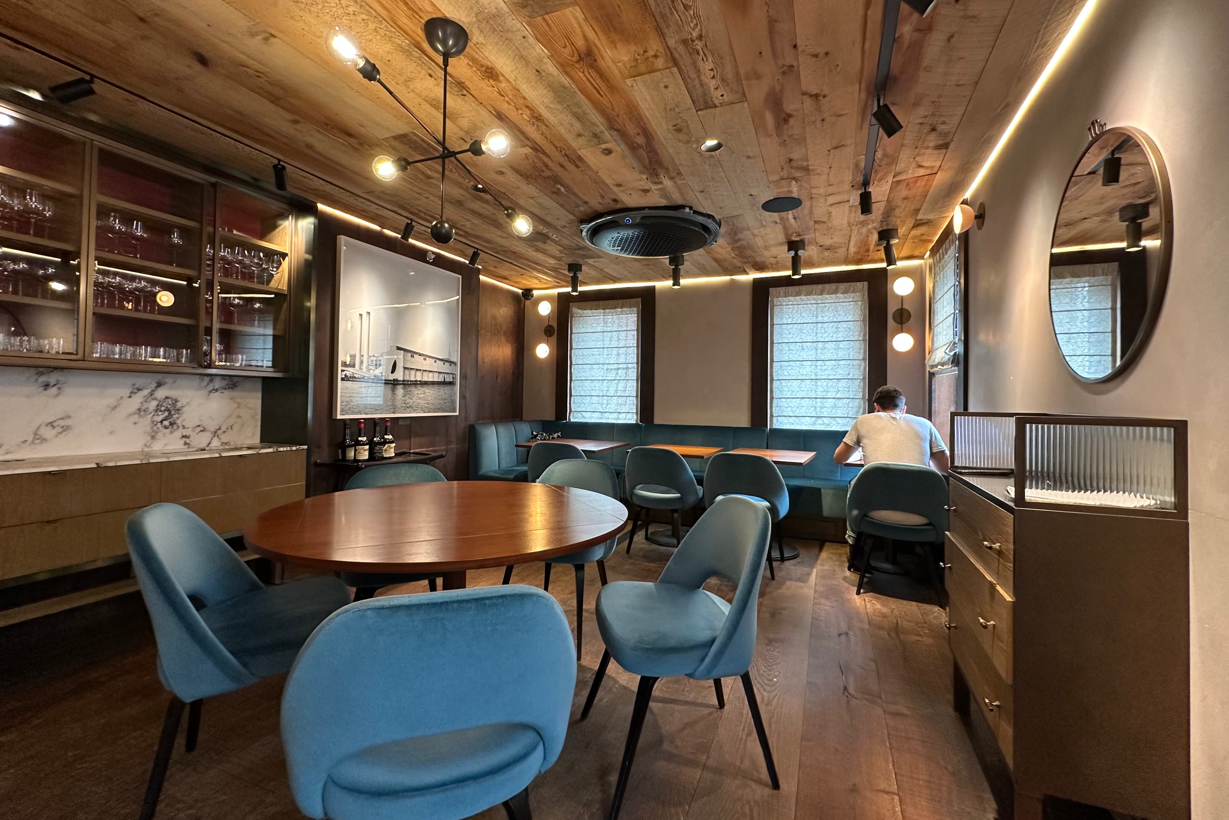
Today I had a tour around their 3-floor townhouse turned restaurant
Left: 1st floor, Right Top: 2nd floor, Right bottom: 3rd floor.
I am going to make some first iterations of the menu based on the owner’s insight: One White Street should feel cheeky yet elevated.
4/4/25
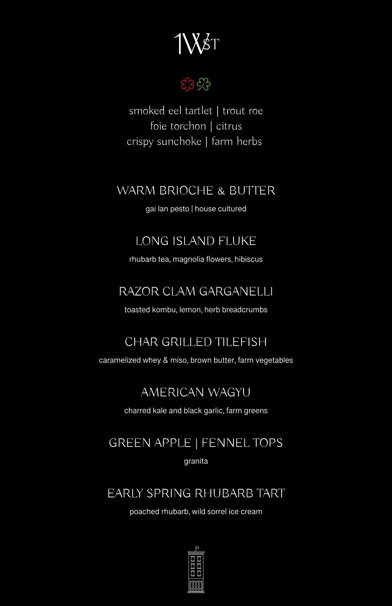
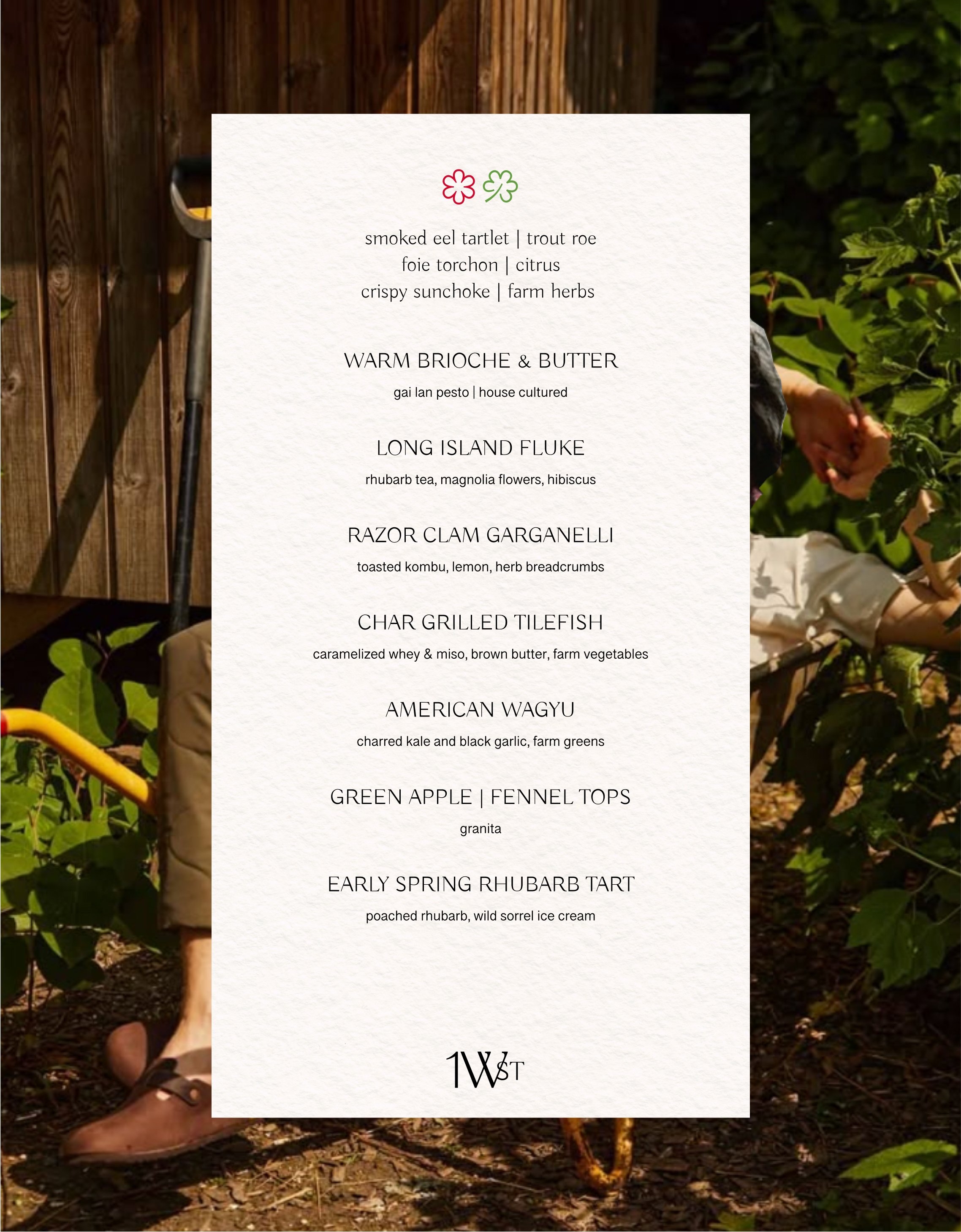
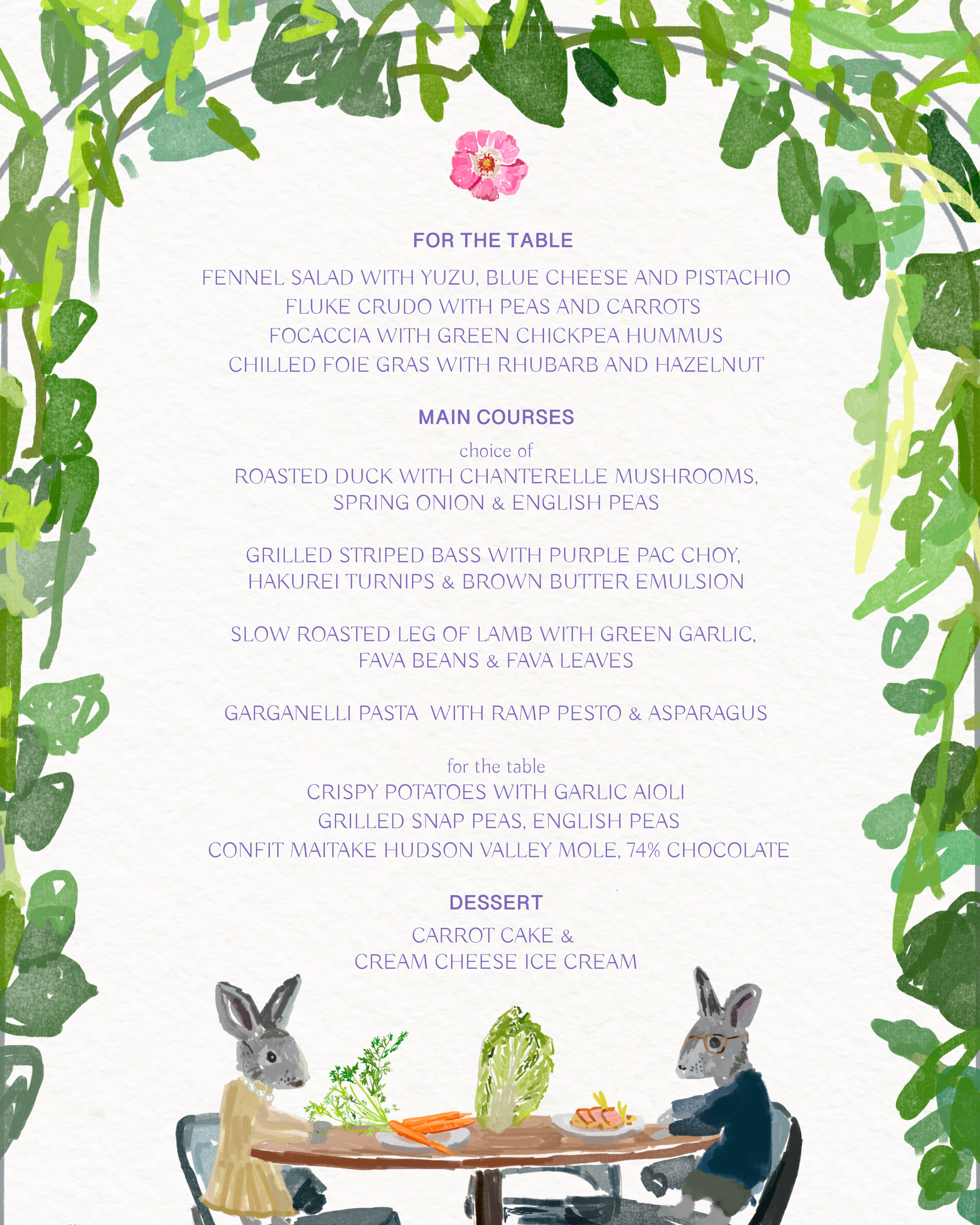
Yesterday I designed the first iteration set of the paper menu.
The drawings were a big part of this new update and they depict 1) the restaurant vibe 2) the owner’s unique likes 3) the history of the building
This is a glimpse of the moodboard of the menu:
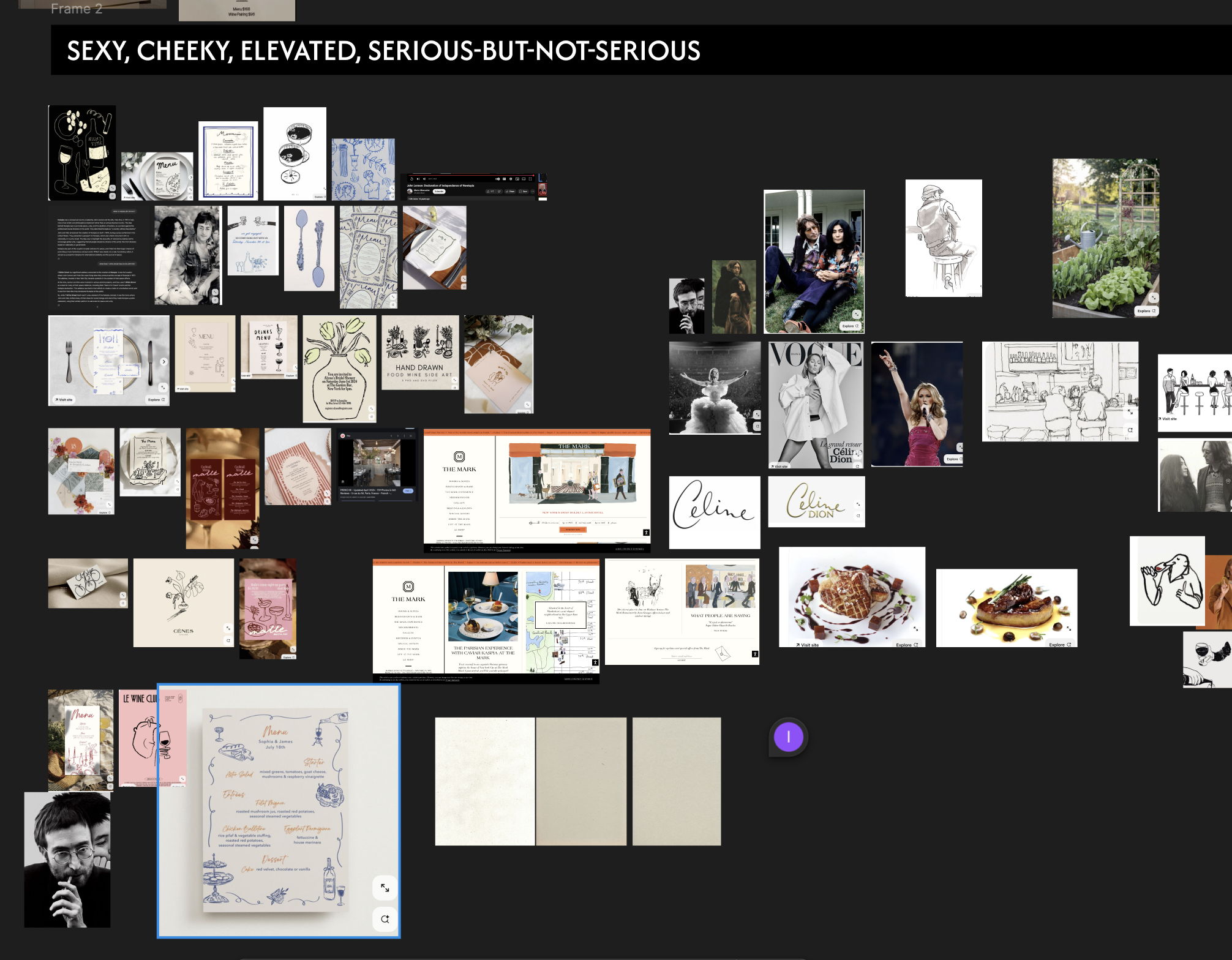
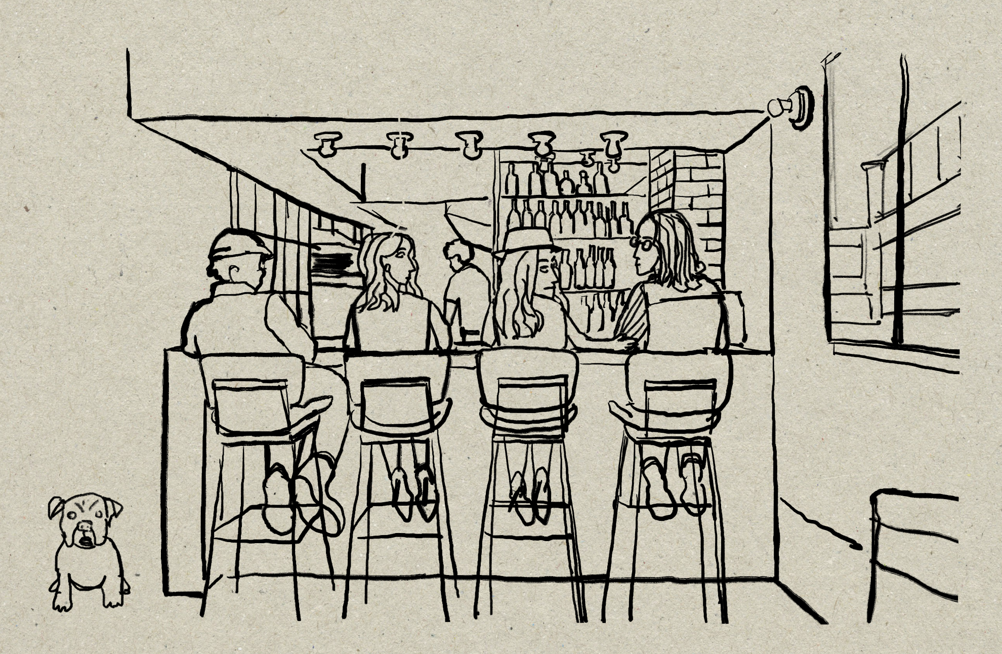
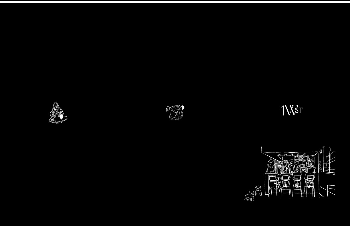
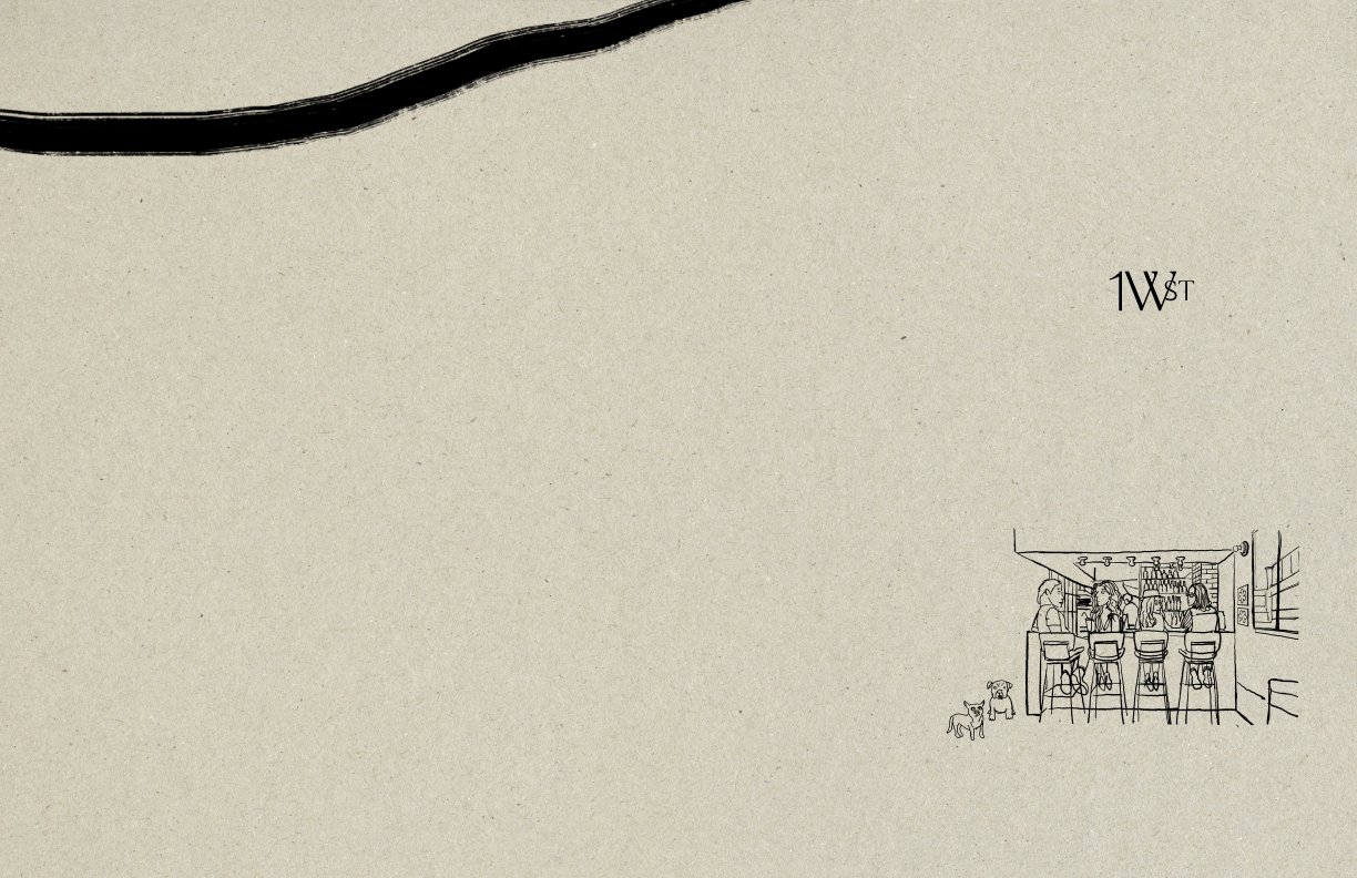
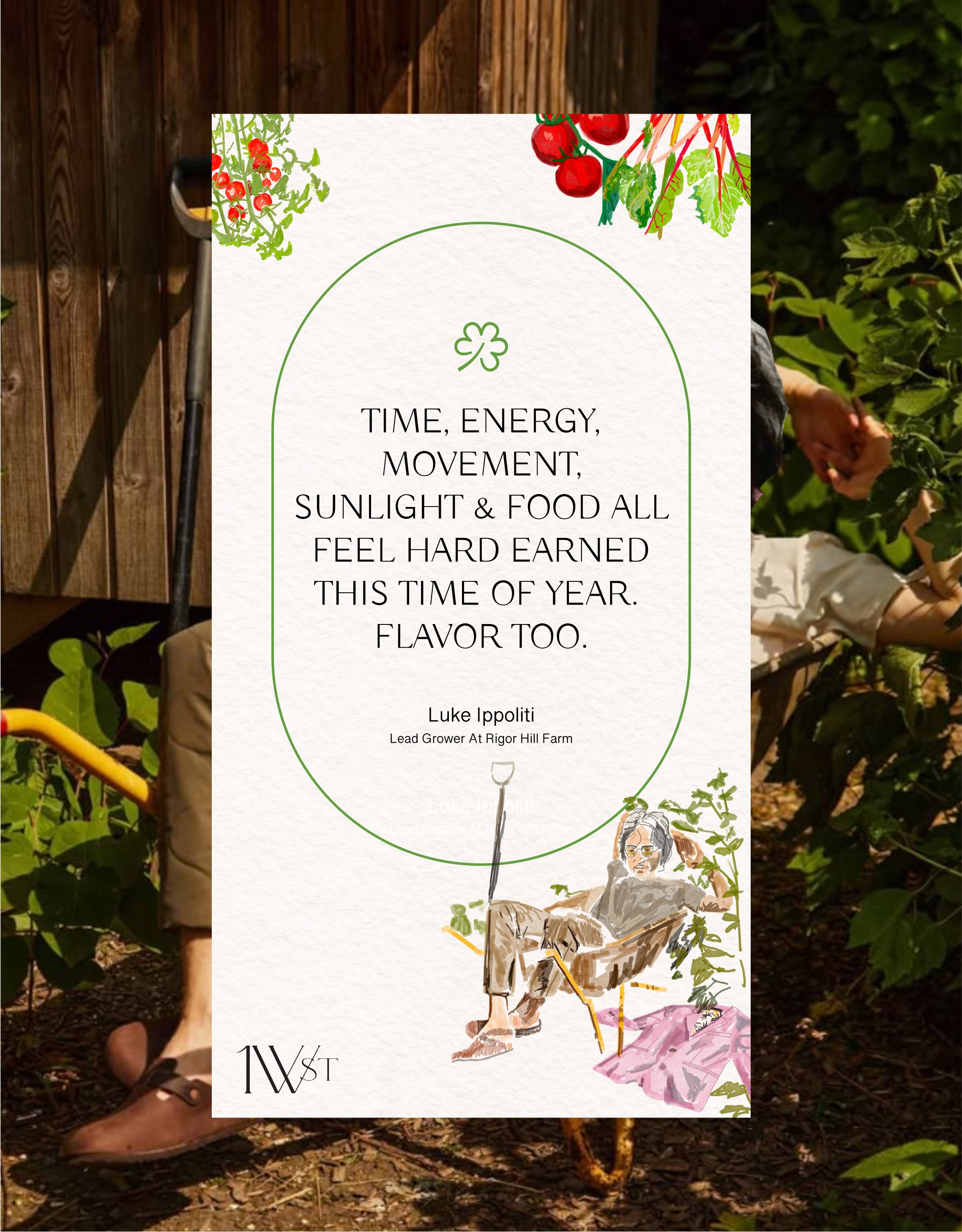
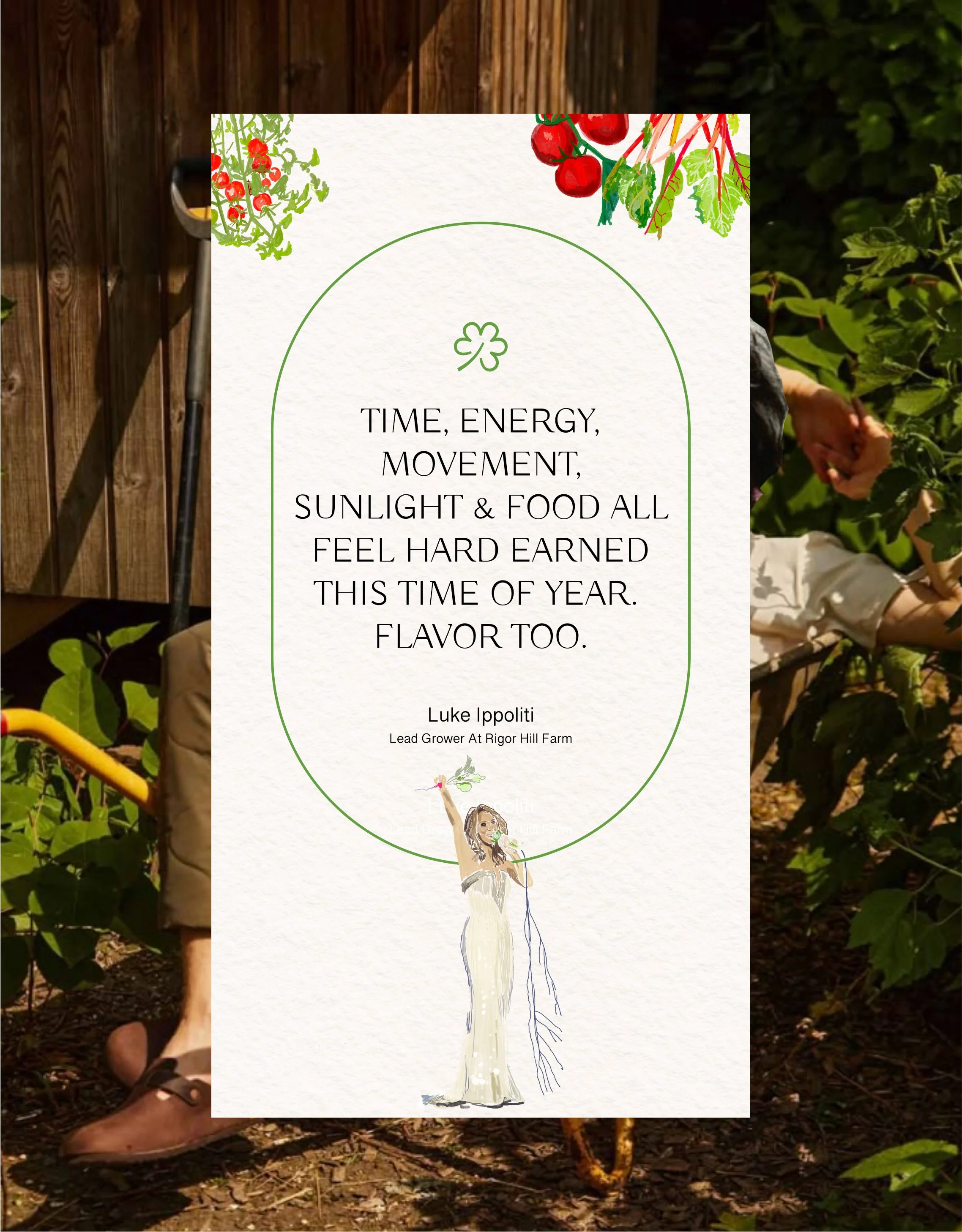
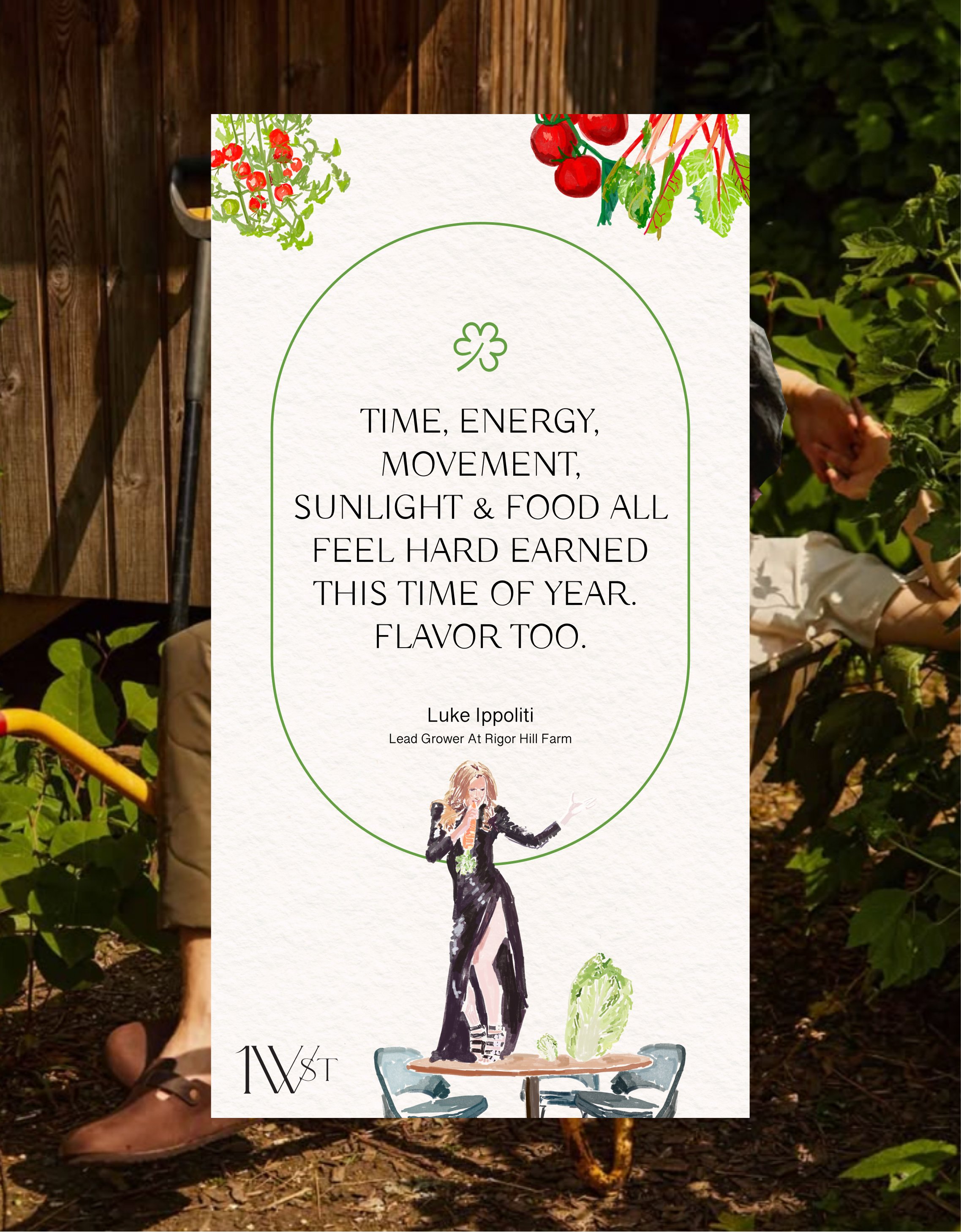
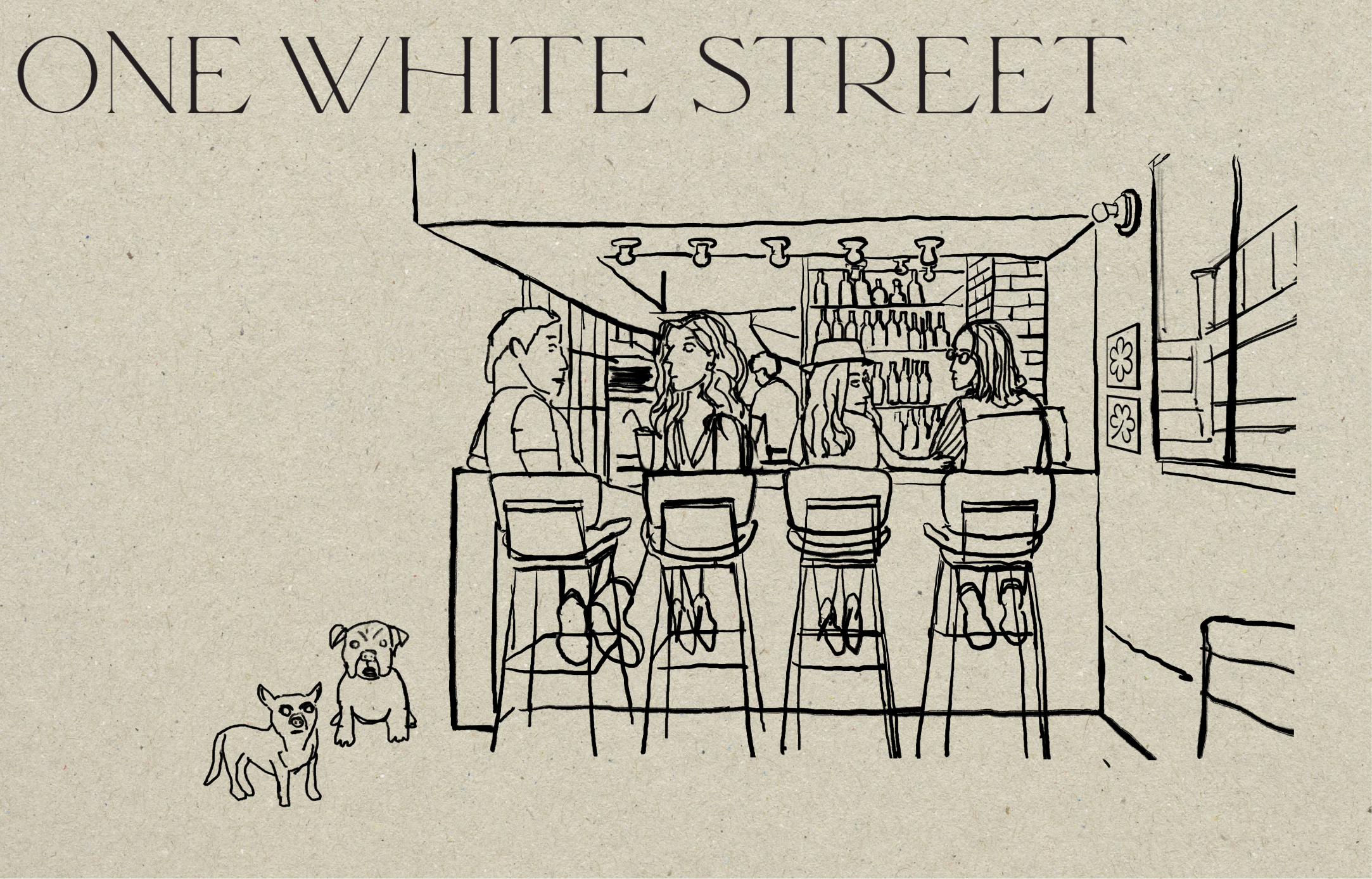
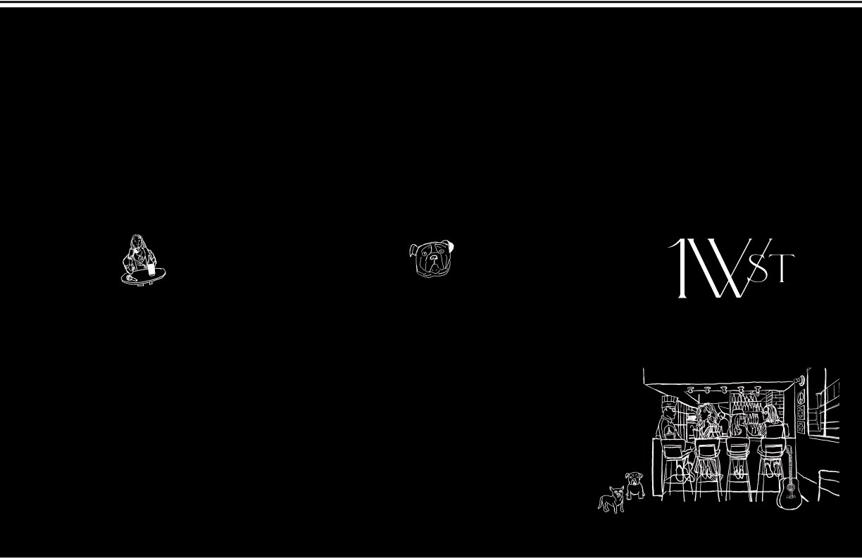
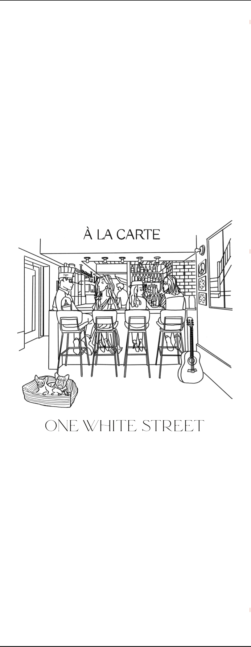
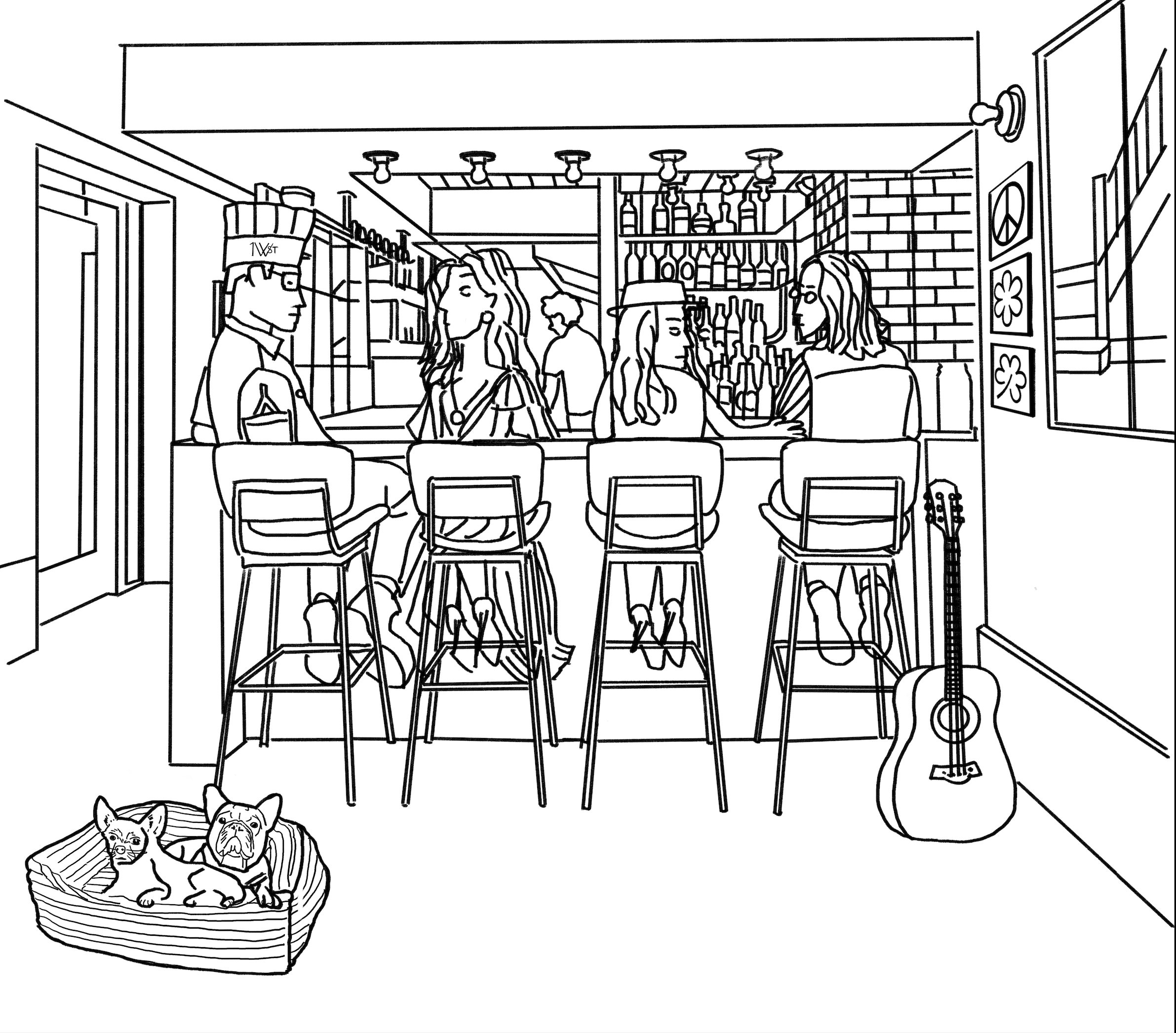
The building used to be a residential space for Yoko Ono and John Lennon and the owner is a big fan of Celine Dion so for one of the drawings, I drew these three folks together + one of the owners’s dog in the A la carte dining space:
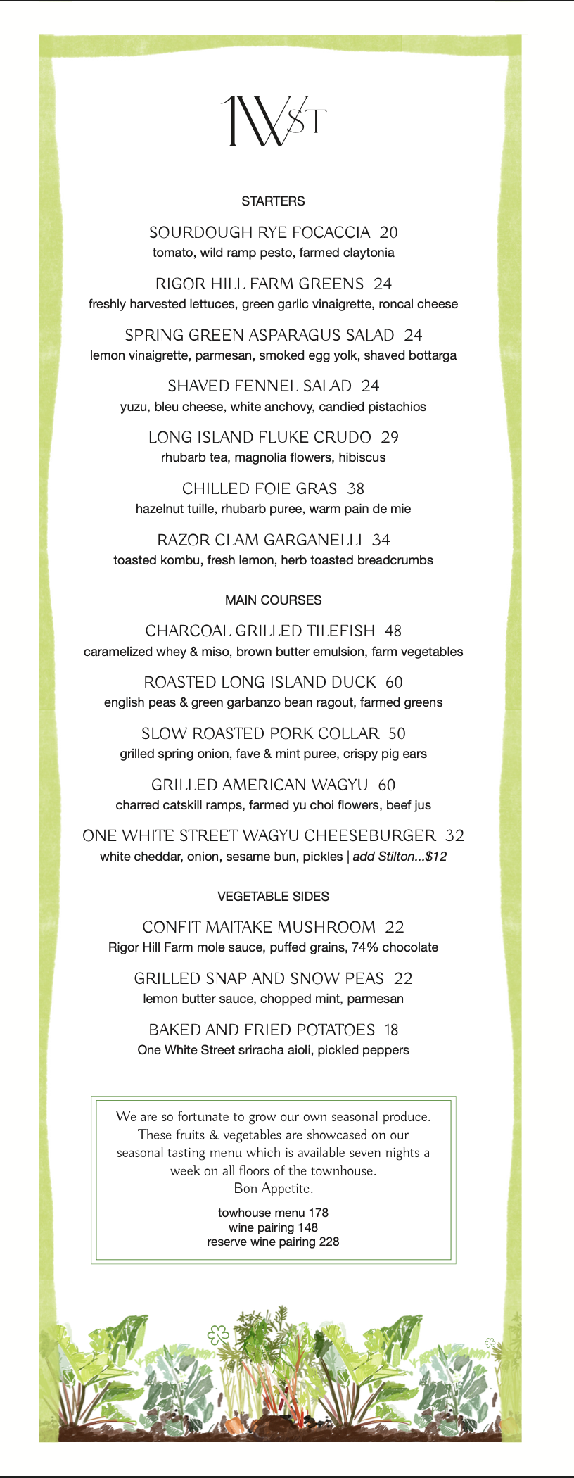
One White Street has a unique history and it is a restaurant that offers both a cheese burger on their menu and afoie gras on the menu and they have their own farm. So it’s definitely a place that has many unique details and personality.
To communicate this complicated but human vibe, I looked at some menu/hospitality businesses that had some unique juxtapositions:
4/5/25
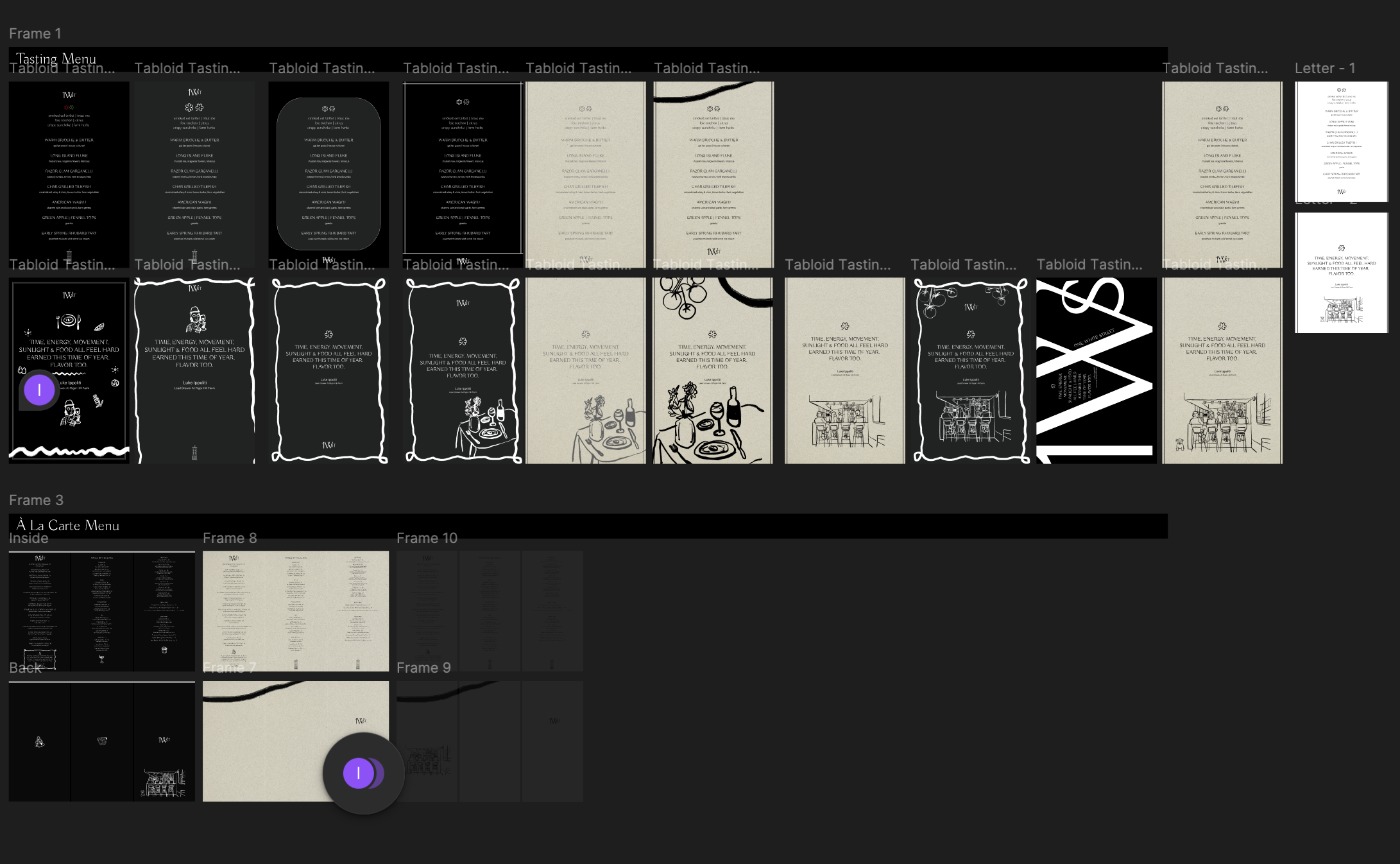
Here are some iterations I made thus far:
Tasting Menu Iteration Set 1


A La Carte Menu Iteration Set 1
Tasting Menu Iteration Set 2


I am proud of the way the iteration set 2 for tasting menu turned out.
The owner wanted the menu to not be boring and wanted this menu to be memorable to people in a sense that it’s something they want to keep and we want to give to them as well.
Currently we don’t hand them out unless the guests ask for the menu.
By incorporating illustrations that showcase different stories of this place, we were able to create something unique yet memorable.
Here were some inspirations:
John Lennon & Yoko Ono (previous residents of the townhouse-turned restaurant)
The owner’s dogs (Bubble Gum & Dion)
The owner’s favorite actress (Celine Dion)
Fresh veggitables & the farm this place also operates (Rigor Hill Farm)


Today I am going to make more versions of the tasting menu and make the a la carte menu with more refined drawings.
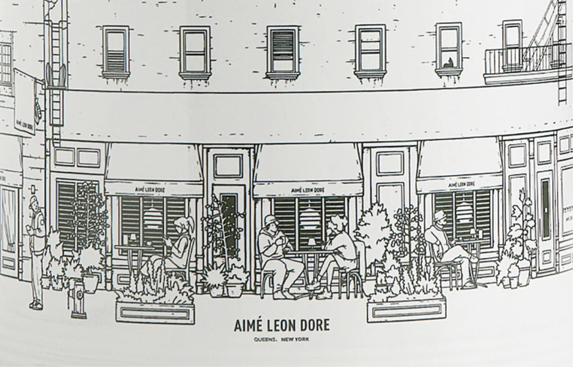
Currently I am inspired by this one below (the right drawing). I think the drawing we have of the first floor with people can be more refined like this on the right:
4/7/25
Today I am refining the a la carte menu. This is where I’d left off:
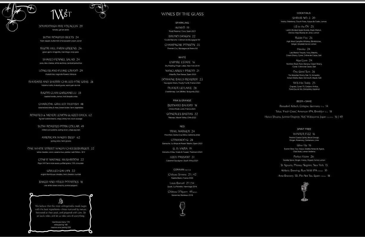

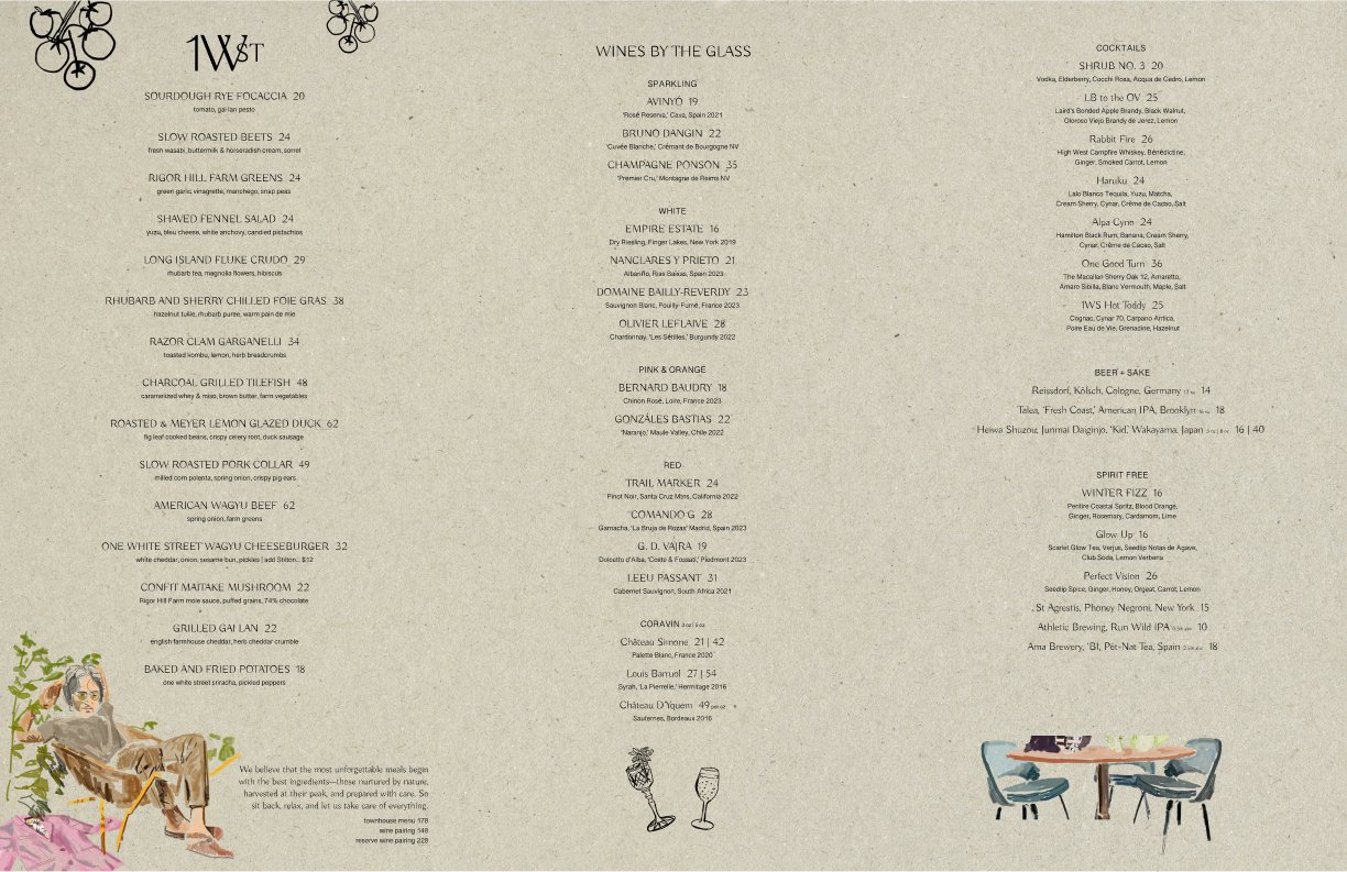
From here, I am going to remove colored drawings and put more of monochromatic illustrations instead to be less busy-looking but still has unique flavors.
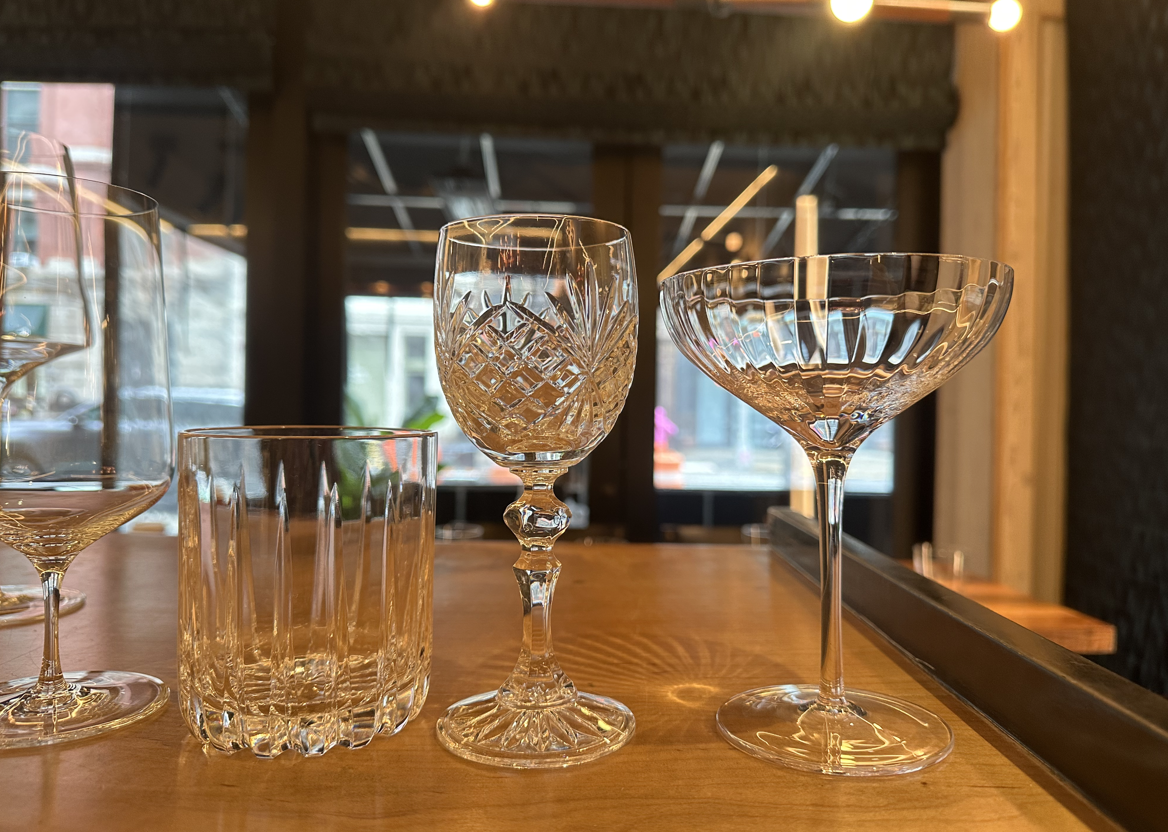
Two panels are drink-related so I am going to be drawing some different types of glasswares we have:
4/8/25
Today I am going to do some test-printing to figure out the right size for our menu.
Here is where I left off thus far with the a la carte menu:
![Legal [8.5_ x 14_]-1.png](https://images.squarespace-cdn.com/content/v1/63fa5fab98b0d26c98b5aaa4/d7f24a6e-54de-468e-bd85-3662c61673ef/Legal+%5B8.5_+x+14_%5D-1.png)
![Legal [8.5_ x 14_]-2.png](https://images.squarespace-cdn.com/content/v1/63fa5fab98b0d26c98b5aaa4/59888848-3e03-4009-be32-94f152544327/Legal+%5B8.5_+x+14_%5D-2.png)
![Legal [8.5_ x 14_].png](https://images.squarespace-cdn.com/content/v1/63fa5fab98b0d26c98b5aaa4/6389cc94-0c4c-446c-a477-ac2a2592c92d/Legal+%5B8.5_+x+14_%5D.png)
![Legal [8.5_ x 14_]-3.png](https://images.squarespace-cdn.com/content/v1/63fa5fab98b0d26c98b5aaa4/266efb58-69a1-4584-8225-6cee2c447d30/Legal+%5B8.5_+x+14_%5D-3.png)
![Legal [8.5_ x 14_]-4.png](https://images.squarespace-cdn.com/content/v1/63fa5fab98b0d26c98b5aaa4/16405a87-5f2a-4258-8a13-3686595c9a1a/Legal+%5B8.5_+x+14_%5D-4.png)
![Legal [8.5_ x 14_].png](https://images.squarespace-cdn.com/content/v1/63fa5fab98b0d26c98b5aaa4/44734aa1-8082-46a6-be6b-bd0e03697a3a/Legal+%5B8.5_+x+14_%5D.png)
The drink drawing was used for the back page along with other drawings to make a chill presence while on the inside it’s more elegant with its layout.


4/9/25
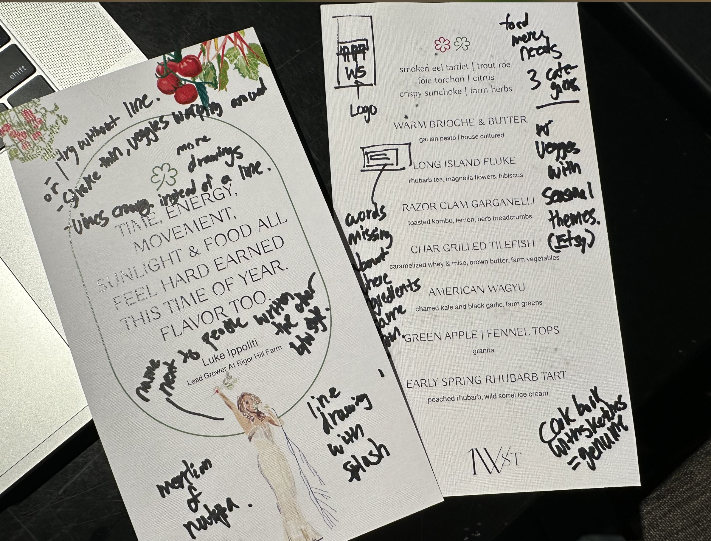
Today I am going to address the inputs I received from others for both menus (tasting & a la carte).
One of the feedback I received that's going to be very helpful is adding the crop marks/cutting marks for these menu so that I can better fold and cut these menu.

4/10/25
Today I am going to print out lots of menu to test out for the night.
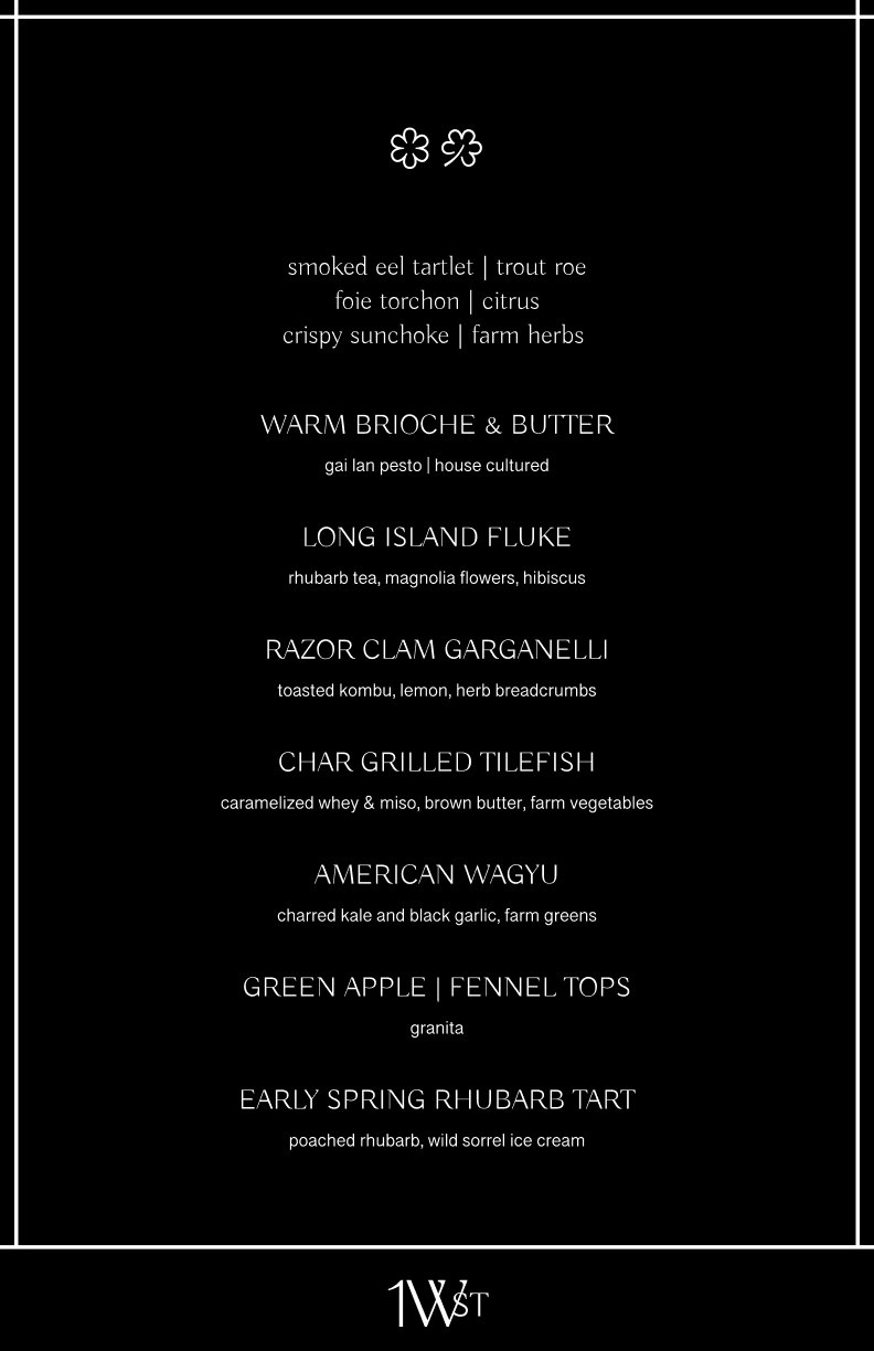
Yesterday I explored another layout for the a la carte menu which has a more sleek black cover while in the inside is more nature-ry.
The other one will have the same inside but the back cover has drawings that tell unique stories of this place.
4/11/25
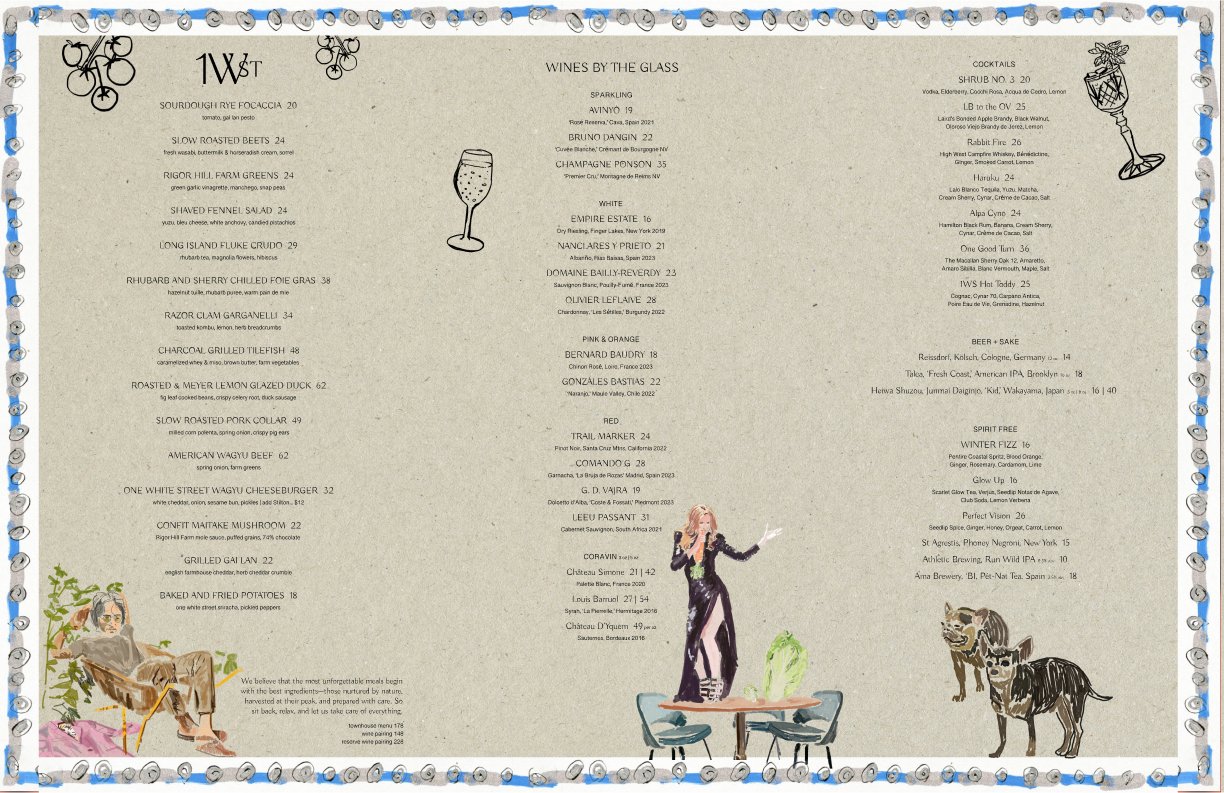
Today I need to change the design a bit so that we don’t need to cut the paper at all.
So I am going to add some borders around the design at least for the a la carte menu to see if it works.
Here is how the design looks which I tested in Figma:
I think the borders work but I definitely will get some inputs from the team members and also for the back cover draw more interesting plants from Rigor Hill Markets which displays plants for sale:
Overall, the menu design project is wrapping up soon and we made a lot of progress.
Below are some images for inspiration for myself for any future iterations:
better and consistent line strokes for the first-floor dining area drawing
more watercolor vibes that incorporates our ingredients


4/12/25
Today I worked on the Instagram posts & the menu for Easter.
Here is the design that was done before:

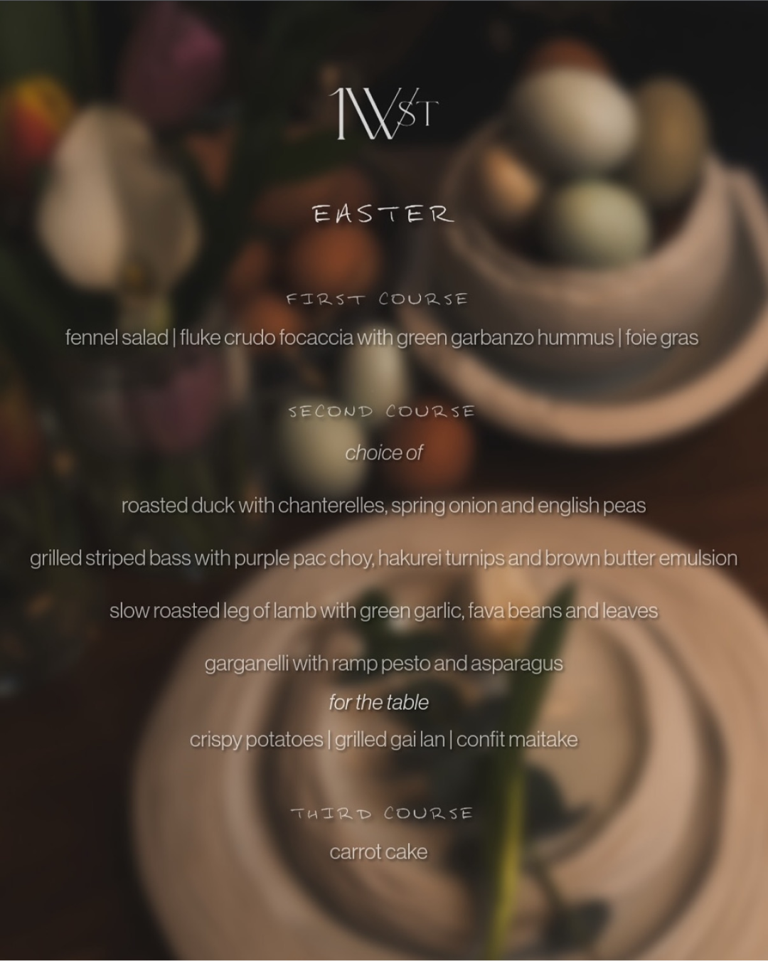
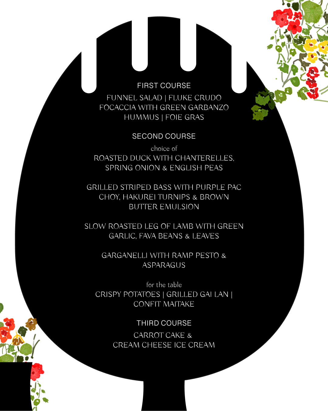
And here were my inspirations for the changes:


Basically we wanted to incorporate the drawing elements again from the new menu design and bring that more elegant font that was also used for the menu.
Below are some iterations and the final Instagram post variations + the menu.


4/21/25
Since last time I journaled, I made some improvements or iterations to the existing designs and I wanted to share as much as I can today with the time that I’ve allotted for journaling.
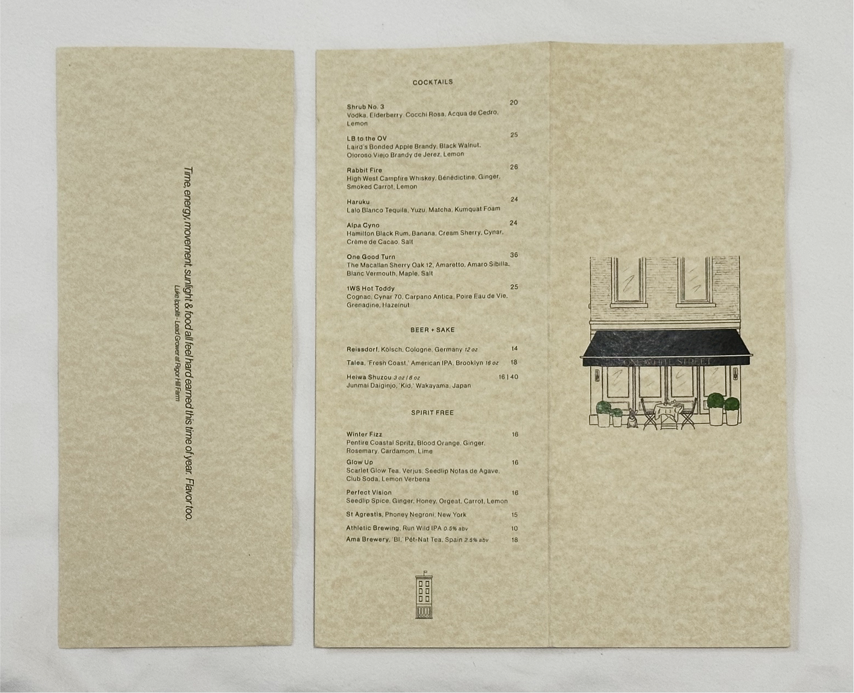
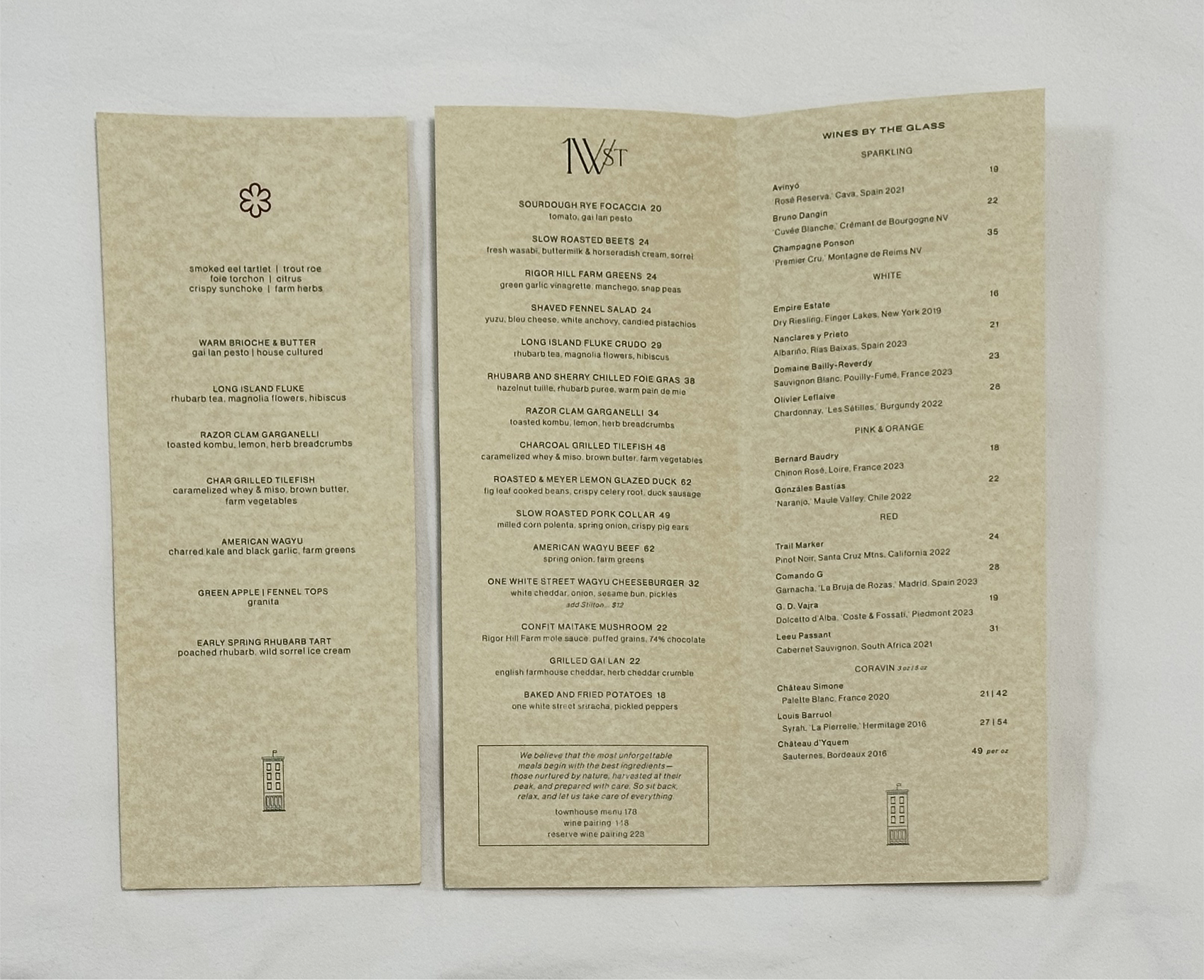
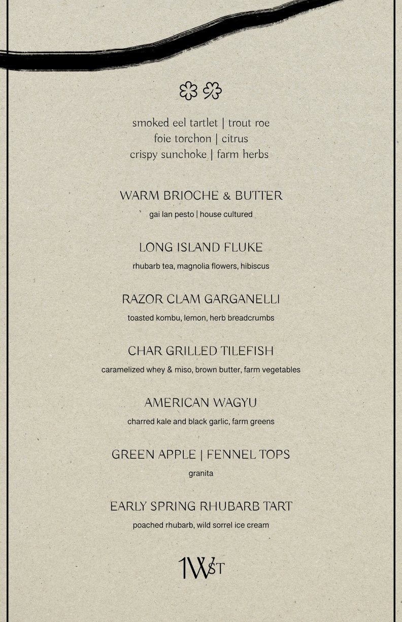
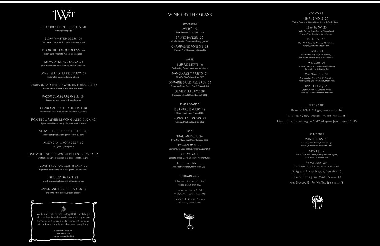
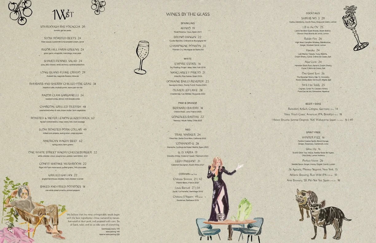
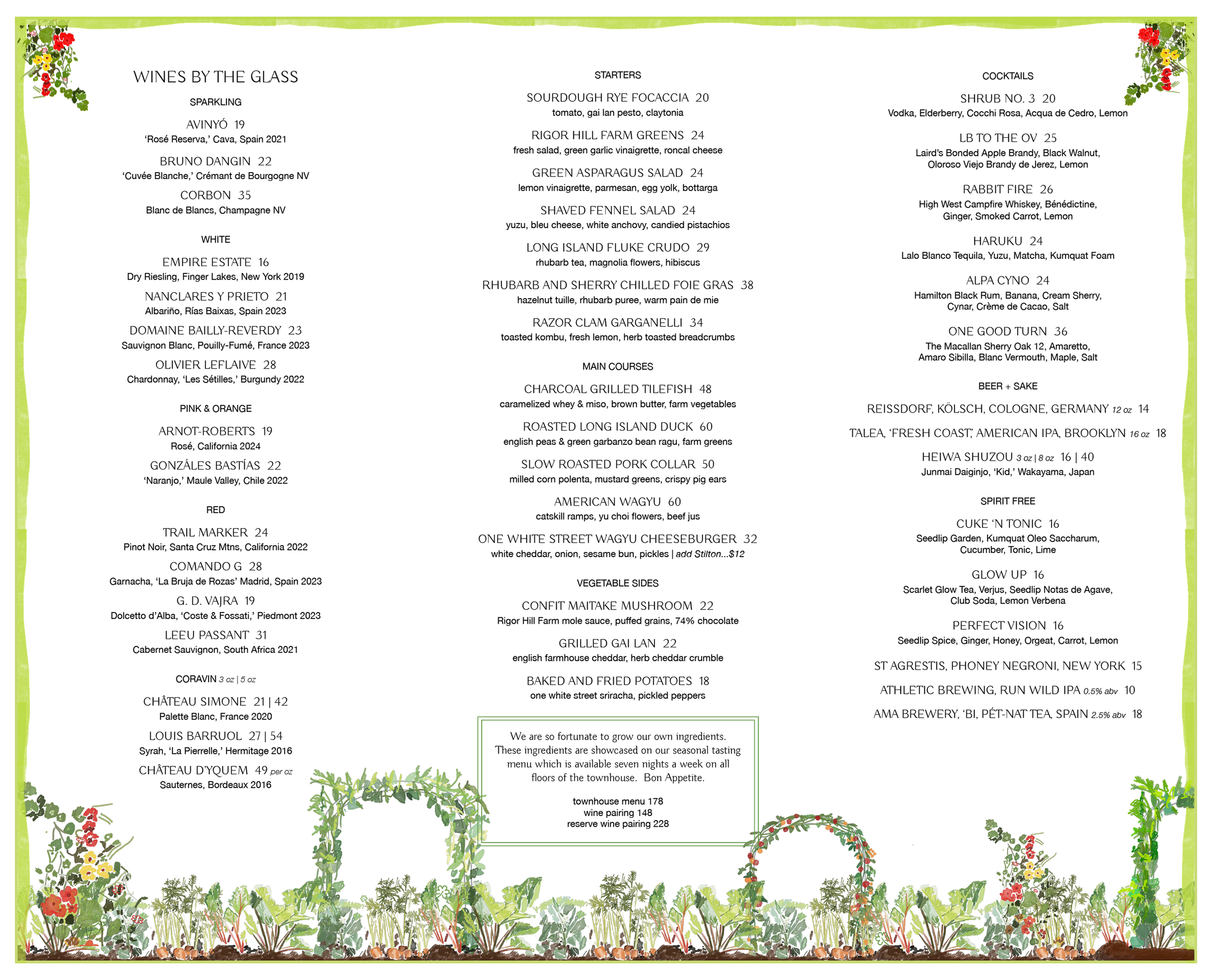
Here is the look of the newest A La Carte menu:
Basically, we decided to make everything from the letter-size paper so that it’s easy to I guess order them instead of doing the custom ordering.
Compare to the other version, one thing I am proud of is the drawing on the cover which I enhanced from the previous one with cleaner line strokes:
Basically, we decided to make everything from the letter-size paper so that it’s easy to I guess order them instead of doing the custom ordering.
Compare to the other version, one thing I am proud of is the drawing on the cover which I enhanced from the previous one with cleaner line strokes:
4/22/25
I think in the last journal, I wrote about new changes I made to some of the designs.
One thing I did today was reformatting the tasting menu so that I can print them with the letter size paper like the rest.
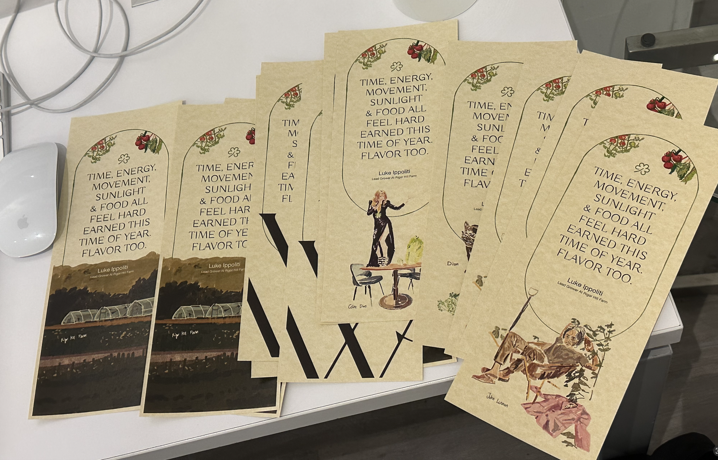
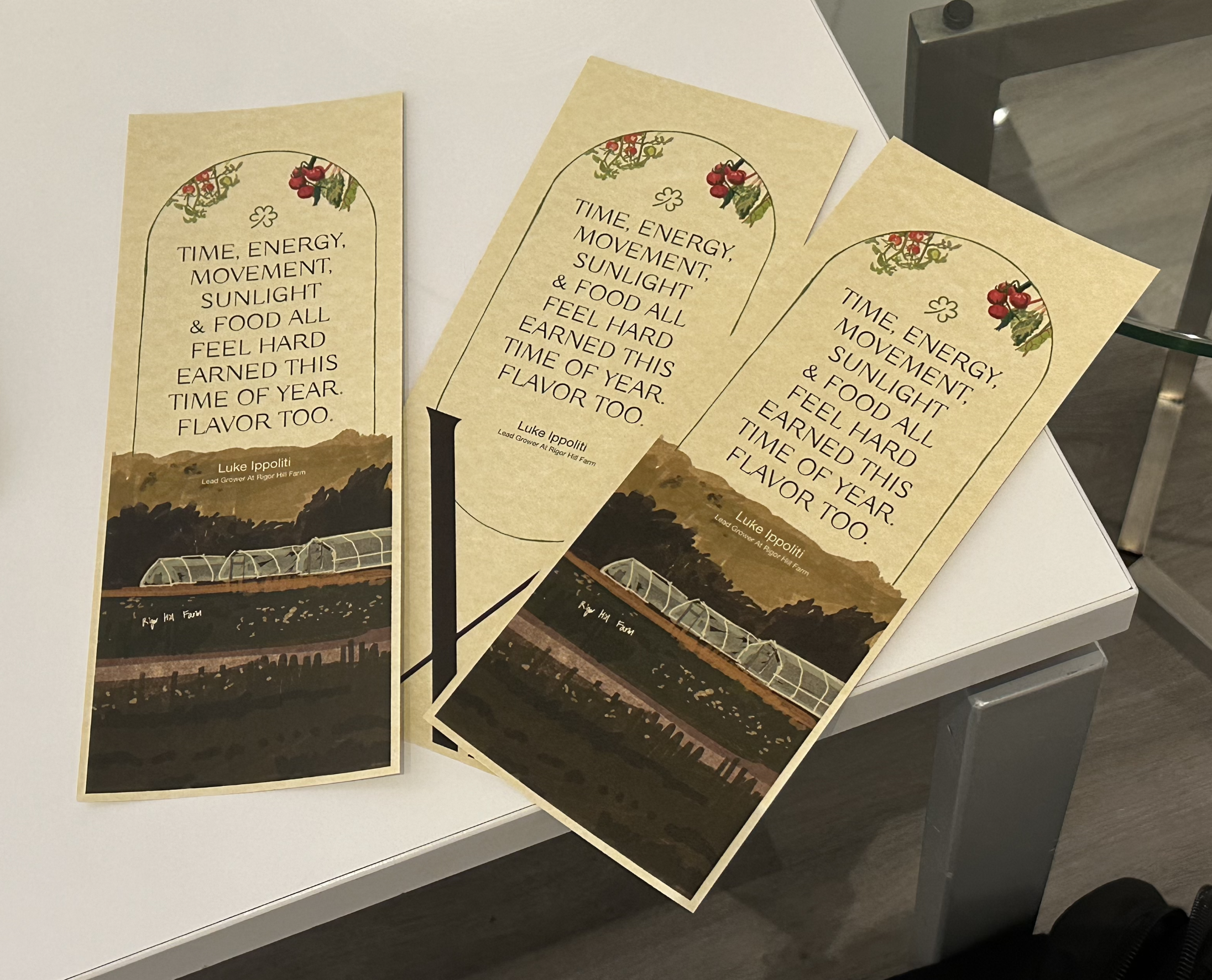
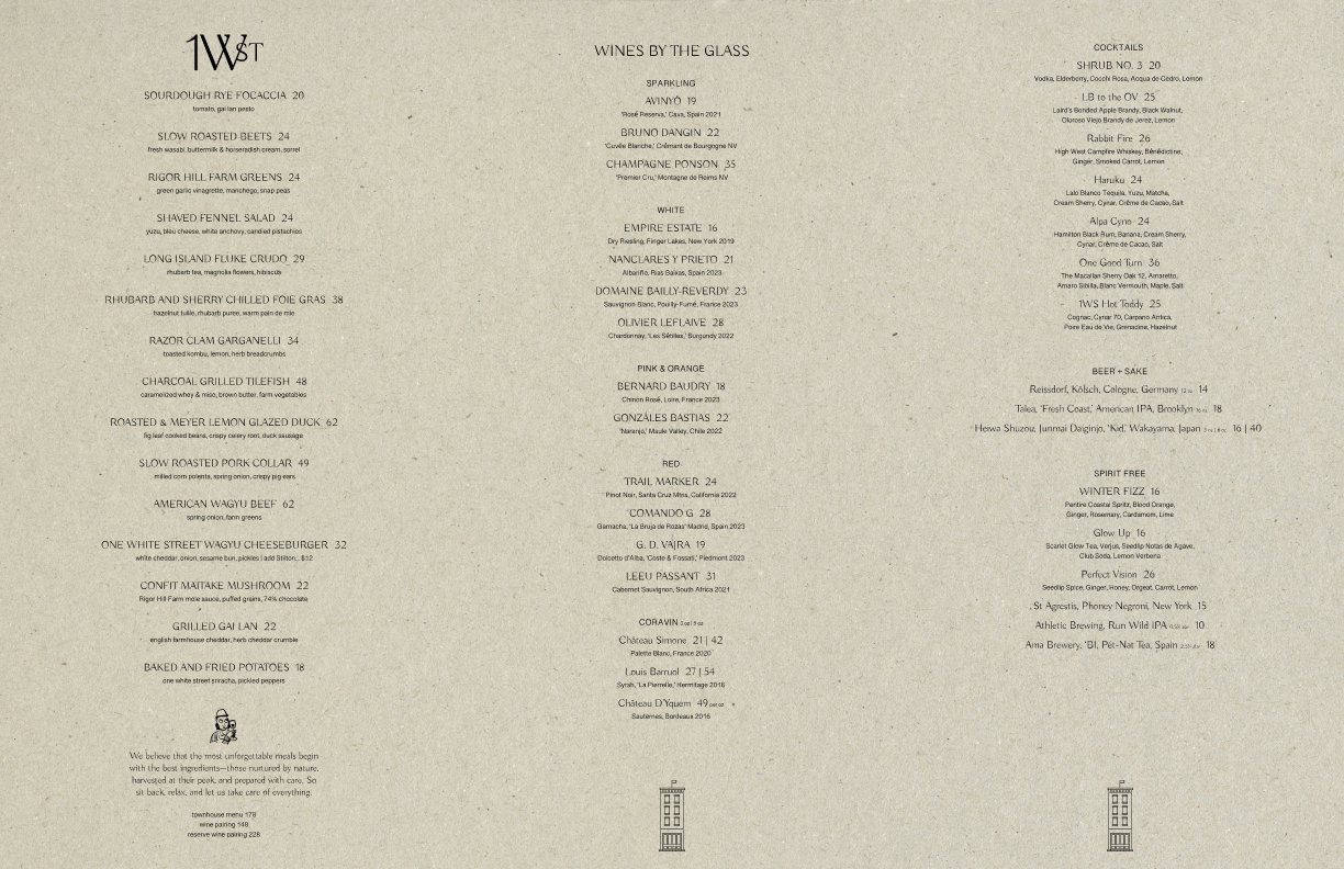
And we also decided to use this tan paper that gives a more eco-friendly, earthy feeling which is cool on its own.
Now, I am doing less of One White Street work as I’ve pretty much wrapped up this project and on Thursday start working on the Catering menu designs for Rigor Hill Farm, the cafe next door.
As I am journaling about this, I am still thinking and asking to myself, “Should I just journaling about show and hospitality?" like mentioned in the other journal from today.
This question came up to me because at the end of the day, I want to just create one business not multiple reasonable ones just because I can do multiple things.